This post will show you how to change the default chart color in Word, Excel, and PowerPoint. You can also change the default color of graphs, charts, lines, or anything else with the help of this tutorial, as these Office apps come with such options by default.
It is straightforward to insert a chart in Microsoft Word, Excel, PowerPoint, etc. You show a chart, lines, graph, area, bar, radar, treemap, or anything else – everything is possible. It is also possible to add a curved graph in Microsoft Excel. The problem starts when you try to add multiple graphs or charts in one document or slide or spreadsheet because they appear in the same color scheme.
We have shown the method for Microsoft Word. Although the names of the corresponding options are different in different apps, you need to go through the same options in Excel and PowerPoint.
How to change default Chart Color in Word
To change the default chart color in Word, follow these steps-
- Open the Microsoft Word on your computer.
- Add a chart, graph, etc.
- Choose a part of the graph to change the color.
- Right-click on that part.
- Select Format Data Point option.
- Go to Fill & Line tab.
- Expand the Fill section.
- Click on the Color option.
- Choose the desired color.
- Repeat these steps.
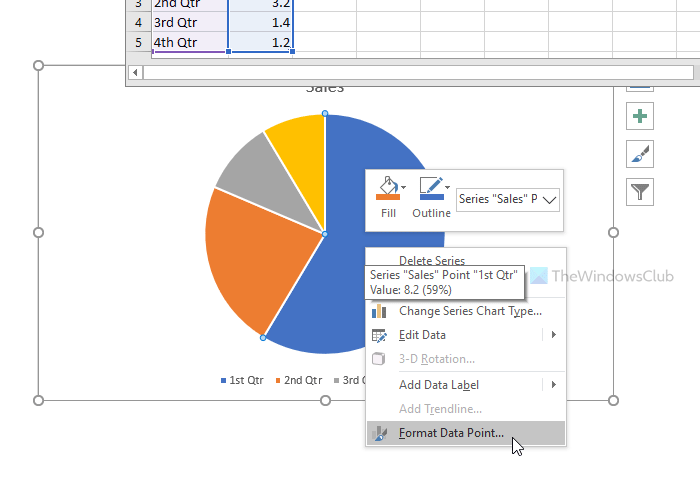
Open the Microsoft Word on your computer and insert a chart or graph in your document. After that, you need to choose a part of your chart or graph to change the color. Then, right-click on it and select Format Data Point option.

Please note that this option is different in Excel or PowerPoint. For example, PowerPoint shows the Format Data Series instead of Format Data Point.
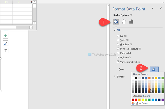
After clicking the Format Data Point option in the right-click context menu, you can find a panel on the right sidebar. It would help if you switched to the Fill & Line tab, which is the very first tab in that series.
Now, you need to expand the Fill section and click the Fill Color button.

Following that, you should be able to choose a color as per your requirement.
Once you finish one part of your chart or graph, you can select another section and repeat the same steps.
That’s it! I hope this simple tutorial will help you.