Microsoft Publisher has so many features and uses that it is like an endless bag of goodies, from simple posters to elaborate calendars. Advertising is one way of getting the word out there, and a banner is a good way to advertise.
Banners are large and will be seen by many people from a great distance. A banner is like a heading; it is a summary of what is happening. If it is properly done, people are drawn in by the heading, and then they come for the details.
How to make Banners with Publisher
Publisher is very versatile and is limited by your imagination. Creating a great banner can be simple if the proper steps are taken. A banner will be printed on multiple sheets of paper to fit the desired length and width.
This article will cover the following topics to show you how to create banners with Publisher and share some tips and tricks.
- Organize resources
- Decide on the look
- Creating the banner
- Printing
- Putting the banner together.
Let us make the Publisher banner
A great Publisher banner is possible if care is taken in planning properly. The steps will be guides that will make it easier and faster to create great Publisher banners. It is also wise to use this banner as a template to create future Publisher banners. Making this banner a template will save time when creating more publisher banners.
1] Organize resources
Knowing the purpose of the banner will make it easier to know what resources to gather and organize before beginning the project. Pictures and other items that may need to be on the banner must be digitized through scanning or camera. You may need glue, cord, tacks, and other items that will need to be secured to put the banner together. The Publisher banner will be printed on multiple sheets so they will need to be glued. The banner may be glued on the wall or placed with string or tacks. These items will need to be sourced and kept for the final steps of the banner. Measure the space that the banner is to fit so that the correct size can be known.
2] Decide on the look
The look of the banner will depend on the occasion. Publisher banners can be used for any occasion, including formal, casual, and informal ones. Below are just a few of the occasions that Publisher banners can be used for.
- Weddings
- Anniversaries
- Birthdays
- Graduations
- Office parties
- Header for notice boards
- Welcome home banners
- Fish fry
Every occasion will dictate the look of the banner, the font, color scheme, style, and pictures. The space for the banner to fit will also dictate the length of the banner. It is also good to note the conditions of the location and will the banner will be exposed to the elements. These considerations will let you know what medium to print on. Creating Publisher banners will give you the option to have your style, which will be unique. Remember that your banner is the visual version of a loudspeaker, so make it attractive. Persons will use the banner’s look to get a feel of the event. Decorate a fish fry banner so that persons will want to come and support and make their mouths water. A technology banner should give a visual representation of what the event or place is about.
3] Creating the banner
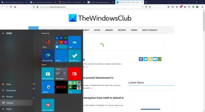
Click start then go to the Microsoft Office icon and click it.
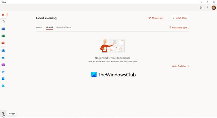
Click All apps at the bottom left corner of the window. This will open a window with Office 365 apps.
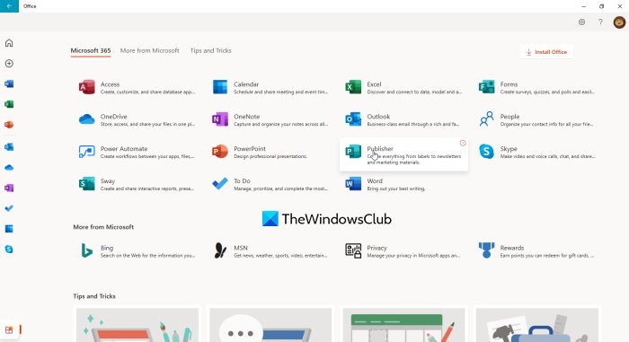
Click Publisher from the list of Office 365 apps that are displayed in the window
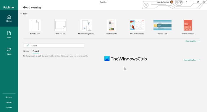
Click more templates to bring up more templates and to also see the options for Office online templates or Built-in templates that are located on your computer.
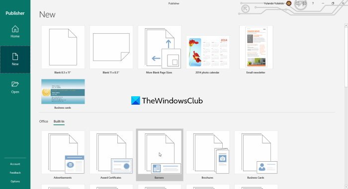
Click Built-in and then click Banner, this will bring up a lot of options for styles of banners.
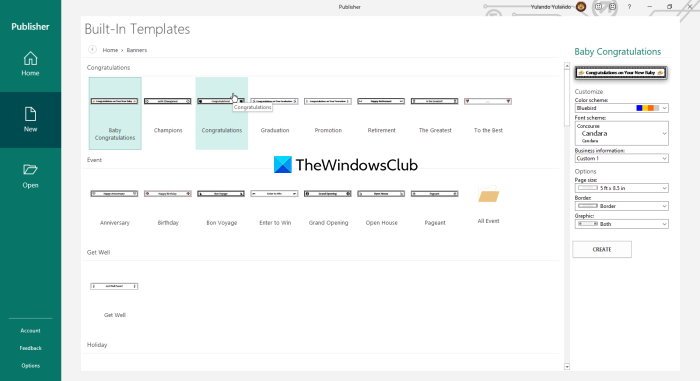
Choose the style banner you like and modify it further by choosing the color scheme and font scheme and adding information. There are also pre-made banners to choose from. If none of these fits your style, you can just modify it later. When this is all done, just click Create to start working on your banner of choice. You will notice that the choices of banner fall under different categories and each has a different design. You may modify the template, and if you have graphics skills, you could build background and other artwork to enhance the banner. If you scroll down, you will notice different blank banner sizes. Remember to save as you go along just in case of any eventualities; you would not have to start all over.
4] Printing
Before printing it is best to pay keen attention to the print preview. Using print preview to see the final result is the best option. Using print preview will help you to see the final result and so you can make adjustments before the final print. Print preview will show the orientation of each sheet and also the number of sheets that the final banner will be printed on. You can make adjustments to make it fit on more or fewer pages.
Printing full-color banner pages
Publisher banners would look great if the color background does not have the white print border. The print border is due to the printer needing to hold the edges of the paper as it passes through. If you don’t mind the white edges or your printer does not print wider sheets, then you can keep the border. If you hate the white print border and you have a large format printer, there is a way to print full color background for the banner. This method is called bleed printing. Bleed printing is where you print on a larger sheet of paper, allow the color background to fill as far as possible, then cut the desired size. This way the background will fill the entire finished sheet of paper.
5] Putting the banner together

During the print preview, you will see that the banner is on multiple sheets. After printing the banner, cut off one of the short edges, overlap on the matching page, and paste.

Ensure you lay out the pages properly for the banner before cutting it. You can cut the paper board to the size of the banner, put the pieces onto the paper board, and paste them onto it. This banner will be heavy; however, it can be mounted by punching holes at the short ends and hanging on a string.
Publisher banners are easy, cost next to nothing, and can be made almost anywhere by anyone. They take little or no skill to create, but some graphic skills could improve the banner. Banners are advertisements, so they should look like the part. Make the banner interesting and attractive. Persons will make assumptions about the event that the banner represents based on the look of the banner.
On the other hand, be careful not to decorate the banner too much. Make sure the banner is visible and readable so that people can pick up the message with a quick scan. We are living in a fast-paced society, so few people want to stand around to read and try to figure things out.
Leave a Reply