Project management is a foundation to meet any business goals within the given time constraints. It ensures that there is a proper plan for executing on strategic goals. Whether you run a small-scale business or long scale business, a good project management tool is necessary for framing a well-planned task and the successful completion of any project. That being said, Gantt Chart is a popular project management tool for planning projects, determining project resources, and scheduling project tasks.
What is Gantt Chart?
Gantt Chart is a horizontal bar chart that illustrates the overall tasks of the project and depicts how long the task will take to complete a project. The chart shows the project tasks on the vertical axis with the time duration on the horizontal axis.
Gantt chart gives a bird’s eye view of the essential milestones of the project and key tasks to be accomplished in the multiple phases of the project. It is a graphical representation of a project plan that helps to keep track of all the tasks in a project over a period of time, boosts creativity, makes way for easy coordination that helps the team understand how the task progresses and manage the overall project.
The charts are mostly used by project managers for their simplicity and the ease with which they can be constructed. It gives a clear picture of the multiple phases of projects, resources, and time duration all in one place. The Gantt chart plays an important role in making effective decisions about project resources and the duration of time required for the completion of any task. In this article, we explain how to create Gantt Chart in Microsoft Excel.
How to create Gantt Chart in Excel
Create a Project Schedule Table
Open the Excel worksheet and Create a table listing each task in your project by order with the earliest start date task entered first and the latest task entered at the end. Enter the complete data into the table containing columns like Start Date, End Date, Description, and Duration.
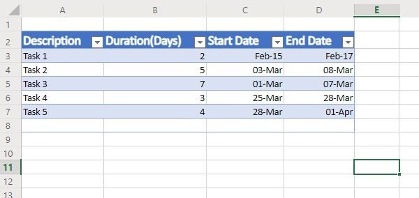
Now click on any black cell on the worksheet and navigate to the Insert tab from the Excel ribbon.
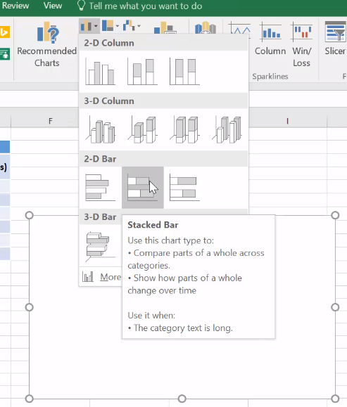
Click the Bar chart icon.
Select the Stacked Bar chart on the Bar chart drop-down menu. This will create an empty chart.
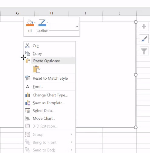
Right-click on the empty chart and click Select Data from the drop-down menu. This will open a Select Data Source window.
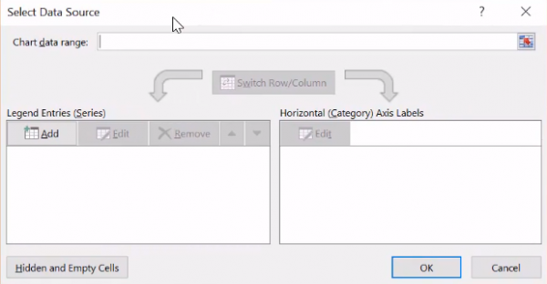
In the Select Data Source window, click Add under Legend Entries (Series). This will open the Edit Series window.
In the Edit Series window, Move your cursor to the empty field in the series name and click on the Start date in the table from your worksheet.

Now move the cursor down to the Series value in the Edit Series window. Click on the spreadsheet icon at the end of the Series values field. This will open a small Edit Series Window.
Now click on the first date in the Start date column from the table and Drag your mouse down to the last date of the column start date This will add the start dates of project tasks to the Gantt Chart.

Click on the spreadsheet icon again which will take you back to the Edit series window. Click Ok on the Edit Series window.
Add duration to Gantt Chart
Once the start dates are added to the Gantt chart, the next step is to add task duration in the Select Data Source window.
In the Select Data Source window, click Add under Legend Entries (Series). This will once again open the Edit Series window.
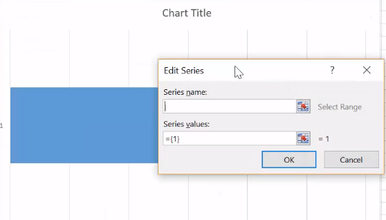
In the Edit Series window, Move your cursor to the empty field in the series name and click on Duration in the table from your worksheet.
Now move the cursor down to the Series value in the Edit Series window. Click on the spreadsheet icon at the end of the Series values field. This will open a small Edit Series Window.

Now click on first data in the Duration column from the table and Drag your mouse down to the last data of the Duration column This will add the duration of the project tasks to the Gantt Chart.

Click on the spreadsheet icon again which will take you back to the Edit series window. Click Ok on the Edit Series window.
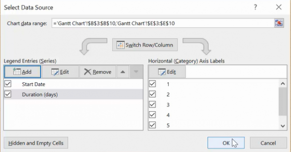
In the Select Data Source window, hit the OK button to build Gantt Charts.
Add descriptions of tasks to the Gantt chart
Follow the below steps to add descriptions of tasks to the Gantt chart.
In the Gannt chart, Right click on the blue bars
Choose Select Data from the drop-down menu. This will once again open the Select Data Source window.
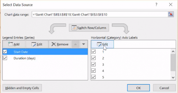
Click the Edit button under Horizontal (Category) Axis Labels. This will open an Axis Labels window.
Click on the spreadsheet icon in the Axis Label window and select the first data in the Description columns of the table from the worksheet and drag them till the end of the Description column.
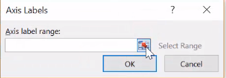
Once done, click on the spreadsheet icon again in the Axis label and click Ok in the Select Data Source window.
Format the Chart
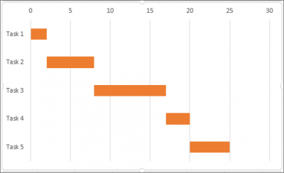
The last step is to format the chart so that it looks similar to a Gantt chart. To make your bar chart appear like a Gantt chart make the blue parts of the stacked bar transparent so that only the orange parts are visible. Follow the below steps
Right-click on the blue bar in the Gantt chart and choose Format Data Series from the menu. This will open the Format Data Series window.
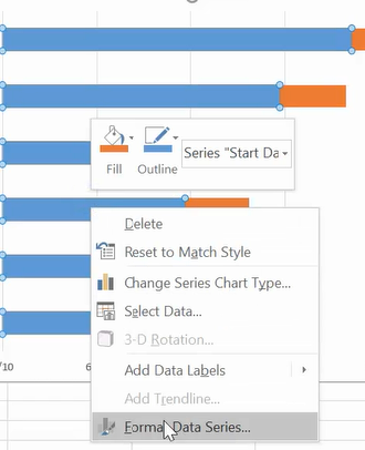
Click on the Paint icon and choose No fill.
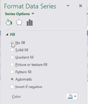
Under Border, choose No Line.
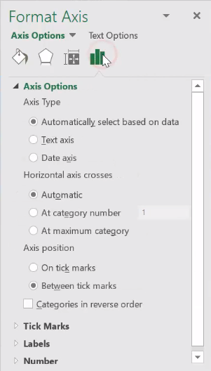
You will see that the Gantt chart is in reverse order and to change this click on the task along the vertical axis in the Gantt chart. This will open the Format Axis window.
Click the Bar chart icon and select the option Categories in the reverse order under the subheading Axis Position.
Your Gantt Chart is ready.
Read: Best Free Online Gantt Chart Maker Tools.
Does Excel offer a Gantt Chart?
Microsoft Excel does not have a predefined Gantt Chart. Therefore, you have to format the horizontal bar graph to create a Gantt Chart. This process may take time depending on your skills in Excel. Alternatively, you can download free Gantt Chart templates from the official website of Microsoft and make your work easier.
How to create a chart in Excel?
To create a chart in Excel, first, select the data that you want to show in the chart. After that, go to “Insert > Recommended Charts.” A new window will open showing you some recommended charts for your data. If you want to view all charts, switch to the All Charts tab in the same window. Now, select the chart of your own choice. Excel will automatically create the selected chart as per the selected data.
That’s all.
Hope you find this tip useful!
You may also like: How to create a Gantt Chart in Google Sheets.
Leave a Reply