It is possible to disable font smoothing in Windows 11/10 using in-built tools, including Registry Editor. You must disable ClearType to turn off font smoothing in Windows 11/10 PC.
Disable Font Smoothing in Windows 11/10
Here is how to disable font smoothing completely in Windows 11/10/8/7
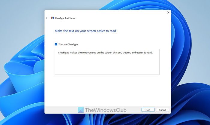
1. On the start screen search box, type ClearType or cttune.exe and hit Enter to open the ClearType Text Tuner. Uncheck Turn on ClearType.
2. Control Panel > Performance Options Visual Effects. Uncheck the Smooth edges of screen fonts.

3. Press Windows Key + R combination, type put Regedt32.exe in the Run dialog box, and hit Enter to open the Registry Editor.
Navigate to the following location:
HKEY_CURRENT_USER\Control Panel\Desktop
In the right pane of this location, look for the FontSmoothing named string (REG_SZ).

In order to remove font smoothing, delete this string using right-click over it and select Delete. Then, double-click the DWORD FontSmoothingType to modify:

In the above-shown window, just change the Value data to 1 from 2. Click OK. You may close the Registry Editor and reboot to get the results.
Use freeware tool Clear Type Switch
The options for text anti-aliasing (Smooth edges of screen fonts) and ClearType are in different locations in Windows. This tool from karpolan.com lets you configure your options easily from one place.
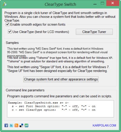
You can enable or disable smooth edges for screen fonts and/or enable or disable ClearType.
I hope you find the tip useful!
Read: How to get Mac-like smooth fonts on Windows
How do I turn off font smoothing in Windows 11?
To turn off font smoothing in Windows 11, you need to press Win+R and enter this command: cttune.exe. Then, hit the Enter button. Next, uncheck the Turn on ClearType checkbox and click the Next button. Following that, go through the screen instructions to get the job done.
How do I make my fonts look better in Windows 11?
There are multiple ways to make your fonts look better in Windows 11. First, you need to turn on ClearType font smoothing. Secondly, you can press Win+R > type SystemPropertiesPerformance.exe and hit the Enter button. Then, tick the Smooth edges of screen fonts checkbox and click the OK button. However, so many third-party tools are available in the market that do the same thing as above.
Check this post if your desktop applications & fonts appear blurred in Windows.

how do you make the system look like aero glass?
When I read this story’s headline — and especially these words from it: “there are some folks who are not satisfied with this stylish look of fonts” — I thought to myself, “WHAT? Who in their right mind would think that it has anything to do with stylishness of font look? It has NOTHING to do with that!
Rather, it has to do with jaggies on the arcs and diagonals of the letters, plain and simple. Without font smoothing and anti-aliasing, letters look like what’s seen on the left in this image…
NOTE: Use [Ctrl-Left-Click] to open all these links in a new tab, then close the tab when you’re done viewing, else you’ll go crazy using the “Back” arrow or [Backspace] key to do it. DISQUS should allow us to specify, somewhere, that we want our links to open in a new tab… but, alas, it doesn’t. Just tryin’ to help.
http://bit.ly/18BnA8P
…but with it, they see what’s on the right in that same image. Here’s another example of a decorative display font with smoothing and/or anti-aliasing turned off…
http://bit.ly/18BnQEB
…and just look at the jaggies! Yikes! No one wants to see that!
Here’s an example, then…
http://bit.ly/18BnZYL
…of how font smoothing can fix the problem. Who wouldn’t want that?
But the story links us to a posting where someone claims to want exactly that. And so I went and read it; and the thread-starter wrote that font-smoothing and anti-aliasing gives him/her a headache.
I’ve been an IT pro for pushing 40 years… about halfway through which I started to get deadly serious about understanding ergonomics, and how BAD ergonomics can cause workplace injury… usually from repetitive stress, but often because of a visual problem. I really seriously studied it; went to one in-person/brick-and-mortar seminar about it; and have, over the years, participated in about a half dozen more online webinars.
With that training, and my experience, I can say, with nearly absolute certainty, that what’s REALLY going on with this person who said that font smoothing and/or anti-aliasing is giving him/her a headache…
…is that s/he needs glasses! Or, if s/he already has them, then their presciption is not right for either or both of the size of his/her monitor, and/or his/her distance from it.
Most people with eyeglasses try to use their computers with their regular everyday, either bi-focal or continuous-vision lenses. Or, with their reading glasses. BIG mistake!
Maybe if they’re using a tablet which they hold at about the same distance from their eyes as a book or newspaper, they MIGHT be able to use their either reading glasses, or their continuous-vision (or bi-focal) lenses; however, unless they also hold the screen more-or-less parallel to an imaginary line drawn from their foreheads to their chins (in other words, if they lay the tablet flat on a desk, and then use it at that angle rather than holding it pretty much parallel to their faces), then virtually ANY pair of glasses will have a difficult time keeping everything in focus.
Even worse, because of how mobile displays work, and what happens to the light from them as it passes through the glass at angles rather than straight on, the smoothing — and especially the anti-aliasing — starts to break down in the light the finally reaches the eye.
All persons who use computers should spend the money for special prescription eyeglasses just for computer use. Early proponents of that only had protecting the eye from the various kinds of radiation that used to come off old CRT tube monitors; and so with the advent of flatscreen monitors LCD and LED monitors, the need for that kinda’ faded. However, one must ALSO get what are in effect just reading glasses (in the sense that they’re just single-vision, and not either continuous-vision or bi-focal lenses), except that they’re focused out to whatever is the routine distance from the computer user’s eyes to the surface of the monitor.
Most people sit further away from a monitor than they hold a book or newspaper from their eyes, and so one’s regular single-vision reading glasses — and ESPECIALLY one’s continuous vision or bi-focals — usually won’t work. What everyone needs to do, instead, is to measure the routine distance of their eyes to their computer monitor, and then go ask their optometrist to simply re-write their reading glasses prescription so that the focal point is out at whatever is that distance. Of course, the BEST way is to go to the optometrist and let him/her do a special exam of your eyes with the single-minded goal in mind of putting the focal point of a single-vision pair of what would otherwise be simple reading glasses out at whatever is the routine distance of your eyes from your computer monitor; and then writing a prescription, based on that, for a pair of what would then single-vision COMPUTER (as opposed to either reading or continuous-vision or bi-focal) computer glasses.
To ensure that said computer glasses will be useful for computer monitors within a range of distances, then the optometrist could “loosen” the focal point a little… that way, the computer screen can be a few inches either way of where it routinely is, and you can still focus.
Or, better yet, there are continuous focus eyeglasses that are specially made for computer use; in which the center of the continuous focus “hourglass” (continuous focus lens wearers know what that means) is much wider than with a normal pair of continuous focus lenses; and the lensing from the middle of the hourglass to the top of the lens allows focus on computer screens that can be a range of distances of MANY inches; and then, the lensing from the center of the hourglass to the bottom of the lens allows one to, for example, better see the keyboard, or, even read a piece of paper laid on the desk between one’s chest and said keyboard so it can be typed-from. Such a pair of glasses would have no usefulness at all in everyday use; and would be very computer-usage-specialist, indeed.
That’s what I’ve done. I have continuous-vision glasses for everyday, out in the world, walking, reading, driving, etc. use. Then I have a pair of single vision reading glasses (because I HATE how the entire width of the page is not in focus with continuous vision lenses, and so I must turn my head a little as I read instead of just moving my eyes). And then I have a pair of computer glasses. I started-out with single vision ones, but I also finally popped for a pair of the continuous vision ones. Once one gets used to them, they’re actually better, but I still sometimes just use the single vision computer glasses. They’re easiest, overall.
And so, yes, whenever my eyes change (as everyone’s do, with age) it means that I must buy at least three — count ’em, THREE — pairs of glasses; and, yes, that’s VERY expensive…
…but I can bygod see like an eagle, no matter the situation. And, trust me, if the person who wants to turn-off font smoothing and/or anti-aliasing could say the same thing, s/he wouldn’t want it turned off. Trust me.
NEVER TURN OFF FONT SMOOTHING/ANTI-ALIASING! Instead, figure out why it doesn’t look right to you…
…be it the need for eyeglasses (either at all, or newer/better ones), or getting an MRI and checking for a brain tumor. Trust me: The reason for the headaches is not the font smooting and/or anti-aliasing.
Trust me!
___________________________
Gregg L. DesElms
Napa, California USA
gregg at greggdeselms dot com
^^ Using WinAeroGlass.
^^ Great to hear your views :)
I should have made it clearer that there’s not a darned thing wrong with this site, and your article, showing how to disable smoothing and/or anti-aliasing. That part’s fine. My point was, and remains, that I just can’t figure out why anyone would want to do it; and to point out that if someone does because it gives him/her a headache, then something else is wrong.
That was my point.
___________________________
Gregg L. DesElms
Napa, California USA
gregg at greggdeselms dot com
I had the same question when I was reviewing his post. Why would anyone want to do it? He then pointed me to that link – which we decided to include in this post.
Well, something ELSE occurred to me… weirdly, last night, while I wasn’t even thinking about it, it suddenly popped into my head that if the person who said s/he’s getting a headache from font smoothing and/or anti-aliasing happens to already have a vision issue, and is using accessibility features; and/or if s/he’s doing that PLUS also setting the monitor down to very low resolution… maybe 256 colors, or even shades of gray rather than color…
…then, yes, I suppose, depending on how s/he has everything configured, that it could be possible that smoothing and/or anti-aliasing produces really odd-looking letters on his/her screen.
The thing is, though, that I’ve never known anyone to post in a forum or newsgroup that s/he needs help with how his/her video is set without also pointing-out that s/he’s using accessibility; or that s/he’s intentionally using one of the lower-resolution video settings; or both. That, then, is on him/her for not so specifying, if, in fact, that’s the case. A person cannot expect others to help him/her without fully disclosing all relevant factors.
Assuming, though, that none of the things I just wrote about is the case (and assuming his/her monitor’s not broken… that’s a possibility, too, you know), then I stand by my that there’s really no reason to ever turn-off font smoothing and/or anti-aliasing… at least not Windows-wide. If a given piece of software — a graphics program, for example — happens to handle all its own font-smoothing and/or anti-aliasing just within itself, then I suppose one might want to turn-off Windows-wide font-smoothing and/or anti-aliasing…
…but, instead, I’d just get rid of such a crazy graphics program as that. That said, one of the reasons that PaintShop Pro — all versions running back to… well… I think maybe the beginning, but certainly back to at least around version 9 — contains an area in the app’s “Settings” or “Preferences” where a person can set how the app handles font smoothing and anti-aliasing, given how Windows already does it (or not). But that’s nothing more than an example of how a graphics app should “play nice” with Windows, itself… something for which I’ve always respected PaintShop Pro. It’s the way that all apps — at least those which in any way leverage anti-aliasing for any reason — should behave.
Anyway… those are my additional thoughts on the matter, for whatever they’re worth.
___________________________
Gregg L. DesElms
Napa, California USA
gregg at greggdeselms dot com
It worked for me thank you for the tip
Buck,
There’s no question that the instructions for how to do it were correct. This website always gets stuff like that right. My question to you is why you’d want to turn-off font smoothing and/or anti-aliasing. I’m not, by my asking trying to ridicule you or anything like that; but if you read the entire discussion, above, you can see why we would wonder why you’d want to do it.
So… just curious. Enlighten us!
Thanks!
___________________________
Gregg L. DesElms
Napa, California USA
gregg at greggdeselms dot com
I did it as it also fixes your monitors
Hmm. Buck’s internet service provider must charge him by the word.
___________________________
Gregg L. DesElms
Napa, California USA
gregg at greggdeselms dot com
What does yours charge by the digit I suppose
I did and find your comments regarding me rude
Buck, I’m not going to argue with you, here; nor did I intend for you to feel like I was being rude. When I wrote that your ISP must be charging you by the word, it was because you’re clearly writing as little as possible in your responses…
…*SO* little, in fact, that you’re not really being understood; you’re not really responding. Yours are, frankly, the answers of a child. I decided to write that your ISP must be charging by the word INSTEAD of writing that your responses are those of a child precisely BECAUSE I did not want to offend, yet I wanted to call attention to the fact that I wasn’t getting anywhere with you trying to find-out the simple answer to a simple question of why you wanted to turn off font smoothing/anti-aliasing; and what do you mean by that it “also fixes monitors.”
I suspect there’s a language barrier; maybe your English isn’t good enough (or perhaps you only THINK it isn’t good enough, when actually it is). Your English doesn’t have to be perfect, here. As long as it’s at least good enough for us to understand, that’s fine. No one cares if you can barely write in English… and no one can identify you, in any case, because you’re using what I presume is an alias, here.
Before assuming that I have ill-will or nefarious intention, try to put yourself in my shoes in this conversation. Your answers, whether or not you like being told it, are those of a child. If you can respond to the questions, though, it would be very helpful. That’s what we’re all trying to do around here: be helpful to one another if possible. My asking why you’d want to turn off font smoothing, and what you mean by that it “fixes monitors,” is so that you can help us understand. Your answers, though, do not help anyone understand; and since you chose to post here (no one held a gun to your head), it’s not unfair for others to comment on your posts; and the paucity of words you’re using is certainly worthy of comment. If that seems rude to you, THEN USE MORE WORDS.
And get a thicker skin, too. Online forums and comments beneath articles can get a little rough, sometimes. As long as it doesn’t go *TOO* far, then it’s all part of what happens in places like this. My joking that your ISP must charge you by the word doesn’t even BEGIN to go too far. It’s perfectly reasonable, given what you gave us to work with.
All that said, I’m genuinely sorry if you were offended. That was certainly not my intent.
___________________________
Gregg L. DesElms
Napa, California USA
gregg at greggdeselms dot com
Gregg you are still doing it merely by saying my answers are
the mind of a child, not only that now I can’t understand the English language according to you and for your information I always received a pass mark in English of 96%.
Look at that font smoothing again by the way it fixes
monitors; going back to the child bit I’m telling you I’m 78 years of age and
resented it
Buck, its best to ignore Gregg. He does this on other sites too.
@Buck | Oy. [sigh] There’s obviously no reasonably communicating with at least some people.
I did not write that your answers are “the mind of a child.” I wrote that, in their outrageous brevity, with no meaningful information, they are like a child’s… a child who answers with as few words as possible and drives crazy the adults trying to communicate with him/her.
I also didn’t write that you don’t understand English; and if it’s true that you got a pass mark of 96% on your English, then you should better have understood that. What I wrote was that *IF* — please note the “if” — the reason why you were writing so little was becuase you’re not good in English, then it’s okay; and that any attempt you make would likely be understood and helpful to us.
You, for reasons only you know, are choosing to write as few words as possible and not explain any of them when asked; and so, WHAT you’re writing is not being understood… as my questions could not have made more clear.
All of that is on you, not me. You’re free to be as mysterious in life as you’d like to be…
…and I wish you luck being understood, in life, doing it.
___________________________
Gregg L. DesElms
Napa, California USA
gregg at greggdeselms dot com
@Anon wrote: …it’s best to ignore Gregg.
MY RESPONSE: Were that you could follow your own advice, Lyndall. Impulse control, it’s plain to see, is a something of a problem for you… as is stalking, it would appear.
___________________________
Gregg L. DesElms
Napa, California USA
gregg at greggdeselms dot com
Thank you Anon for the advice I’ll definitely heed it
Clear type or any kind of font smoothing looks horrible to me because I have above average and exceptionally sharp vision. I can see every single pixel on an LCD screen from normal viewing distance. Clear type works very well if your vision is slightly blurred to start with but if your vision is sharp then clear type makes it look blurry. What I mean is I can actually see the detail of how it attempts to make the fonts look clearer which causes my eyes to try focusing something which cannot be focused, resulting in eye strain and tiredness. It should be called font smoothing and blurring. The text on screen is actually clearer with clear type and any kind of smoothing disabled, even if it does have jagged edges, it is still clearer. This is why some people wish to disable it. The pixels on my screen are nice and sharp, I do not wish to blur them into their neighbors.
@xorpheus, what is the size of your LCD screen; and its resolution? In other words, an answer something like (in the form of) “19-inches diagonally,” and “1280×800 resolution” is the sort of thing I’m looking for.
Or, even easier and faster, you could just provide the LCD monitor’s brand and model number from the sticker on the back. Or if it’s part of a notebook or laptop computer, then the brand and precise model number (from the sticker on the bottom) of that would work.
Thanks!
__________________________________
Gregg L. DesElms
Napa, California USA
gregg at greggdeselms dot com
Assistive Technology software like Zoomtext recommends disabling font smoothing for improved performance.
Yes, becauuse those technologies usually take full control of the image… including smoothing, or not. In other words, it’s not so much that they want smoothing off (although they might), but, rather, it’s that if there’s to be any smoothing, then it’s the assistive technology that wants to handle it; to either mke it happen, or not, at its option, without having to fight WIndows, itself, for control of smoothing… or not.
__________________________________
Gregg L. DesElms
Napa, California USA
gregg at greggdeselms dot com
This. Exactly.
And yes, even if my sight is worse now, I can still see the “clever clear type” effect, ie. blurriness on the fonts. Something in the algorithm makes my eyes try to focus something which is not there. With 24 inch monitor, 1920×1200 res.
ClearType stopped being a problem when they came out with Windows 7.
xorpheus, I have the same problem you do. ClearType makes the fonts look blurry to me, and my eyes keep trying to focus to eliminate the blur. The jagged fonts might not look as pretty, but they are sharp, and my eyes can focus on them. This is the case for all kinds of LCD monitors so long as the graphics resolution is set to the native LCD monitor resolution.
Gregg, you are wrong. Blurry fonts are NOT better for many people, including me. I like the fonts to be sharp so I can focus on them. My eyes interpret blurry as meaning out of focus, so they keep trying to focus on ClearType fonts when that is impossible. I do not care if the sharp fonts are jagged. I like my pixels on or off, black or white. Stop trying to inflict your preferences on others. If you like ClearType, fine. Just give me the option to turn it off. I always have and always will hate font smoothing.
ClearType is always a problem for me. It looks blurry and makes it hard to focus. Turning off ClearType and font smoothing looks SO much better. I do not care if it is “jagged”.
BTW, I had to dump Internet Explorer and go with Firefox because Internet Explorer does not have an option to disable ClearType.
FRED WROTE: Gregg, you are wrong. Blurry fonts are NOT better for many people, including me.
MY RESPONSE: I never said that “blurry” fonts were better for anyone; and so you are making a classic straw man argument of first alleging that I said or wrote a certain thing, and then arguing against *THAT*, and not what I actually wrote. Stop it.
I say similar of your “[s]top trying to inflict your preferences on others” silliness. No one — including and especially me — is trying to do that. Again, stop it.
In my very first posting, here, I made my points. I stand by those points. Some of them are conditional points; and many who have taken issue with me, here, have ignored those conditions.
Anyone whose vision is provably 20/20 or better (or is corrected to same), and who has no either vision or brain anomalies, will find anti-aliased/smoothed fonts to be more pleasing to the eye. I cannot account for how the eyes and brains of those who either do not have 20/20-or-better vision (or whose vision is corrected thereto), and who do have either or both of eye or brain anomalies, will see; and what they’ll prefer.
Set your screen however you want, and stop whining like a child because others have opinions that differ from yours.
_____________________________
Gregg L. DesElms
Napa, California USA
gregg at greggdeselms dot com
So anyone who does not agree with you must have “eye or brain anomalies”. Give me a break. Anything “pleasing to the eye” is subjective. It is your opinion only. There are plenty of people who do not like font smoothing. I am sure there are also a lot of people who wonder why their screen looks fuzzy, but they have no idea how to fix it.
TO: Fred Comment
Again, Straw Man, read my original posting. It’s all there. Stop arguing against what I never wrote.
I repeat: Set your screen however you want, and stop whining like a child because others have opinions that differ from yours.
Is that not good enough for you? Or will you not stop this trollish behavior until and unless you’re simply ignored?
[shakes head in disbelief] Oy. [sigh]
____________________________
Gregg L. DesElms
Napa, California USA
gregg at greggdeselms dot com
Gregg, thank you for allowing me to set my screen however I like. I lived without font smoothing for about 20 years before Microsoft decided to inflict it on me, and I was just fine.
My main complaint is not with people like you but with Microsoft for not making it easier to turn off their blurry font smoothing. In Windows 7, you have to turn off Clear Type, and then you have to go to a separate place to turn off font smoothing. Even after that, you cannot get rid of it in Internet Explorer.
There should simply be a check box under display options that says “give me sharp, jagged fonts instead of the blurred edges that Gregg likes so much.”
FRED COMMENT WROTE: There should simply be a check box under display options that says “give me sharp, jagged fonts instead of the blurred edges that Gregg likes so much.”
MY RESPONSE: I believe that’s a checkbox slated for inclusion in Windows 9.
___________________________
Gregg L. DesElms
Napa, California USA
gregg at greggdeselms dot com
If they actually put an easy option to turn off ClearType in Windows 9, and they allow me to keep that option in Internet Explorer, I will regain some respect for Microsoft. Bringing back the Start menu would also help a lot. Would compatibility with old 16 bit software also be a possibility. Doubtful, but I can hope.
I am a displays (optics) engineer. I create test patterns for testing displays and I carry out these tests. I need (not want) – need to create test patterns using Windows Paint (.bmp) to ensure the colors are at precise gray levels (0 to 255) and that the fonts are precise white on black characters. I don’t want any gray shading in the test pattern that I didn’t put there. Likewise, I don’t want any gray shading in the fonts that I didn’t put there.
I also need to create drawings for components that are used in displays. It is likewise important that the components I sketch can be easily copied and pasted. So again I use .bmp files to generate the original items, which I may need to copy, paste, edit, etc., before I hand off the drawing to a mechanical designer to finish and enter into the drawing library.
Finally – I have OLD eyes. YOU might think you know what you are talking about in terms of readability of fonts but you are WRONG. I’ve been in the displays business for over 25 years. I know what looks good to my eyes and what doesn’t. Too many designers are like you, making presumptions based on your own prejudices. Try doing some actual human factors studies. Or at least look at the studies that have been done in the past by guys like Robin Merrifield when he was at Boeing. Check out the Air Force human factors research. Stop presuming you know what you are talking about.
Geez, will this conversation NEVER end? It’s over a year old, now, and nothing of actual value is being added…
…especially because what I suspect to be just one or maybe two person(s) is(are) now posting as multiple personalities — one even changing his/her name, here (thereby effectively “breaking” the names to which I indicated I was responding in some of my comments) — just to make it look like there are more people of an opposing opinion to mine than there really are.
ASTROMATHMAN WROTE: YOU might think you know what you are talking about in terms of readability of fonts but you are WRONG.
MY RESPONSE: So you, under a different name, here, have told me. What ELSE is new?
ASTROMATHMAN WROTE: I’ve been in the displays business for over 25 years.
MY RESPONSE: I’ll see your 25 years, and raise you 40 years.
ASTROMATHMAN WROTE: I know what looks good to my eyes and what doesn’t.
MY RESPONSE: So do people who need glasses.
ASTROMATHMAN WROTE: Too many designers are like you, making presumptions based on your own prejudices.
MY RESPONSE: Er… well.. plus the results of literally hundreds of man-years of field testing by universities, and Microsoft, etc.
ASTROMATHMAN WROTE: Try doing some actual human factors studies. Or at least look at the studies that have been done in the past by guys like Robin Merrifield when he was at Boeing.
MY RESPONSE: And I was at McDonnell-Douglas. What’s your point?
ASTROMATHMAN WROTE: Check out the Air Force human factors research. Stop presuming you know what you are talking about.
MY RESPONSE: Really? You’re citing the Air Force? The same Air Force whose top general and its senior civilian were fired in 2008 in response to a series of nuclear-related errors, starting with the mistaken arming of a B-52 bomber in 2007 with nuclear missiles and the unaware pilot flying over the US?
The same Air Force which, less than a year after that lapse, mistakenly shipped to Taiwan four electrical fuses designed for use on nuclear intercontinental ballistic missile?
THAT Air Force?
It strikes me as YOU who should stop presuming you know what you’re talking about; or, at the very least, that I don’t.
What I don’t understand, though, is we why can’t just disagree and leave it at that. This is becoming an obsession with you… something you should take-up with your shrink, I would think.
________________________________
Gregg L. DesElms
Napa, California USA
gregg at greggdeselms dot com
i suppose it’s your opinion…. but when my text,…. on browsers and on some UI look like a photo that’s been zoomed. NO thank you. I like the way text looks when it only uses linear pixels and doesn’t add fuzzy little sub (grey rendering to the edges). if that is your thing then go for it, but Microsoft should not try to shove things that nobody asked for and should have a very SIMPLE solution like “if you want, go right a head and turn it on” if you don’t then that’s ok too… just my too cents
you are a total… never mind… my screen resolution is 1440×900 ok? it’s an LCD type. Laptop. Microsoft messed up by not allowing people to disable clear type in windows vista to windows 8. Unless you have to do some work. So there. Not everyone likes the fuzzy looking type. sorry just my two cents
nice resolution. ;)
ahhm maybe because he doesn’t like how the fuck*** letters look?????? do you even have a fuc**** brain. Before you respond that question ask yourself….. ‘do i have a brain?’ then thing about this. WE don’t all like clear type fonts! They are bothersome to some of us visual wise. We rather have the jagged edges but clear to look letters. IS THAT so hard to understand??? If you prefer something don’t you think that some one else has the same right????????????
The one, single person stalker of mine who keeps coming back here and posting pretty much the same ol’ rant, obsessively, for months even after the argument was clearly long over, and as if he were several others who all agree (and he, I and God all know who he is) is obviously off his meds, as evidenced by not only that he keeps doing it, but also the facially unbalanced/nutty content of his posts.
[shakes head in disbelief… and pity]
See a doctor. Seriously. Life’s just too short for this…
…even for you.
_________________________________
Gregg L. DesElms
Napa, California USA
gregg at greggdeselms dot com
That you suggest the default should be that font smoothing be off by default, and that Windows users should have to turn it on if they want it (instead of that it should be on by default and that Windows users should have to turn it off if they don’t want it) speaks to your cluelessness about what the vast majority of Windows users prefer. Wanting the jagged edges is not normal, and no amount of your wishing otherwise will ever change that. That you would have Windows default to the profound minority method just because it’s your preference, with no regard on your part for what is the majority view speaks to your narcissism.
View it however you want. The point of the article is that it can be turned off. Why aren’t you just doing so, and enjoying it, instead of making such a pathologically big deal about it even months and months after this argument was long over? Are you THAT obsessive compulsive? There are meds for that, you know.
Please see a doctor and get some.
__________________________________
Gregg L. DesElms
Napa, California USA
gregg at greggdeselms dot com
Microsoft is not known for doing very thorough user studies and base their feature decisions on that. Often times, like many tech companies, they’re based on some product manager’s preference and pushing a ‘neat’ feature to be the default for a vast majority of users, who hold opposite views. This seems to be the case for ClearType. The ultimate failure is NOT having it in a clear and concise location to disable/enable for users. Instead it’s buried under ClearType (a marketing term btw), and also gray-scale font-smoothing (under control panel -> system -> advanced -> performance settings).
Thank you! thank you! thank you! thank you! thank you!
^^ Glad we could help :)
Gregg, you said this: “Anyone whose vision is provably 20/20 or better (or is corrected to same), and who has no either vision or brain anomalies, will find anti-aliased/smoothed fonts to be more pleasing to the eye”. Do you understand what you have written? If so, how exactly is it a “strawman argument” when ALF is simply reiterating what you said?
By saying “anyone [with normal vision will find font smoothing more pleasing]”, you’re implying that anyone who prefers pixelated fonts has brain anomalies. Which is not only offensive, but incorrect – as it is purely opinion based and is backed by absolutely no study or research.
Nothing is sharper than a white pixel next to a black one – that’s the definition of sharp. By adding an intermediate step between those two points, you’re creating blur. Font smoothing works by literally blurring the text.
Some people prefer sharp text, some people prefer smooth. It has nothing to do with poor vision or brain anomalies. Going on like a broken record just proves how self-righteous you are, you can’t seem to cope with the fact that some people have different opinions to your own. You also can’t seem to understand what you have written. I suggest you read the statement I quoted – it’s very clear that you’re implying that anyone who disagrees with you has poor vision or a brain anomaly.
Perhaps the only brain anomaly here exists in a person who believes their opinion is fact.
I like the font without smoothing
And the trees were all kept equal
By hatchet, axe, and saw…
Perhaps pianos should be designed so they are always slightly off pitch, and can’t be tuned. After all, only those with perfect pitch can tell the difference.
If you think 20/20 is sharp, perhaps your vision is simply not sharp enough to see the effect. My vision is 20/15, so I not only see every pixel, I can see that they are rectangles.
I hear you. Unfortunately some of the tools I work with require IE. I used to be able to switch off anti-aliasing there too, but this week the IT department pushed us IE 11, and I can’t anymore.
I browse the ‘net with Firefox and nearly everything is crystal clear. I visit the same sites with IE and everything is fuzzy. It’s as though the image were on a projection screen, and I want to adjust the lens slightly to bring it into sharp focus.
cleartype is not necessary on crt monitors as they already have a bit of convergence
Wizard, I am sorry you are stuck with IE. IT departments tend to take the easiest path. I will never understand why Microsoft wants to force people to look at fuzzy fonts. Sometimes I think Microsoft executives sit in a conference room laughing about the garbage they force on their customers.
GRACIAS.
Kudos from Caracas.
To “fix” Chrome:
disabled DirectWrite in chrome://flags.
!!!
More people have sharp near sighted vision than the number of people that are blind or deaf. I wish the < 5% with it weren't ignored. I can see subpixels ~4ft back from a 27in 1440p monitor. I don't particularly enjoy having rainbow crap splattered all over my text, so greyscale or (ideally) no font smoothing would be ideal for me. I've grown rather fond of blocky styles like Minecraft and Minecraft text, because heck, it's all blocky looking to me. Might as well go for style. :P
Sadly, with Win10 it is insisting on having a blurry mess everywhere regardless of the setting.
ClearType is horrible. It’s using the coloured subpixels of the LCD monitor (red, green, blue) to fake as if the monitor had 3 times the resolution. Problem is those are coloured pixels and not black and white pixels. You get this blurred text with rainbow coloured roundings. I’ve used the calibration utility for best match but it’s still bad for my eyes. I can easily read stuff on my LCD straight 8 hours without ClearType but turned it on I can just read a couple minutes. I can’t focus because the text lacks contrast. It’s blurry. I’ve got a high quality Eizo monitor. Maybe it’s too good for this fake technology. So why fake these pixels? It’s because normal LCD monitors, so called 2K monitors, only have 90 DPI, meaning they have quite big pixels. This has never been a problem to me as I like pixels. Traditionally computers have had pixels visible and I’m alright with that. This technique depends on the current implementation of LCD screens but ClearType does not work with CRT monitors and it might not work with future monitors if those have truecolor single pixels – so I think it’s a very bad innovation. The worst computer innovation ever. ClearType might work with 200 or 300 DPI screens like with mobile devices and 4K screens but not with low DPI desktop monitors. Such a stupid thing and now they don’t care anymore doing fonts that respect the desktop monitors, so called ‘web fonts’ render so bad on 90 DPI monitors without ClearType it’s horrible. This problem never existed before. It only came couple of years ago and now it’s a problem on half of the web sites. Why invent technology that brings nothing but problems and confusion to billions of people? We were all alright with traditional font rendering. Pixels never bothered me.
I understand very well. My usuall word while reading cleartype is f..k! f..k! (i my language:)
“From Windows XP to Windows 8, Microsoft has improved the way Windows displays fonts.”
No, they didn’t. That’s exactly the problem.
XP displayed fonts perfectly on both CRT and LCD monitors and Microsoft, once again, screwed everything up in an another attempt to fix something that wasn’t broken.
If the intent of font anti-aliasing isn’t actually to make it easier on font designers who would otherwise be burdened with actually checking to see that their fonts look good on multiple resolutions and in multiple font-sizes, but instead to increase the number of pixels used in rendering fonts so that they’re smoother, why don’t we just use ‘multi-pixel’ rendering? Also known as using bold-faces.
In more information dense materials (encyclopedias, dictionaries) you’ll see those sharp fonts as they reduce ink bleeding; The bold-face fonts that are often seen in cheap literature aren’t seen quite as often when you’re moving to books that have actual information, though some might use slightly bolder fonts. However, these fonts are typically for those who are hard of seeing, not those who aren’t blind as a bat.
Additionally, many clear-type fonts are NOT designed correctly and look worse with clear type off due to the font design, not due to sub-pixel rendering actually improving the fonts in general. The images you posted are issues that would not occur on correctly designed fonts. Arial, for instance. I started this off talking about intent because you have conflated the effect of font anti-aliasing on fonts that are poorly designed with the effect of font anti-aliasing in general.
Finally, I’ll note that not only do I believe you aren’t stupid enough to actually go read this (if you are, I pity you) but I don’t care what you think… In normal human dynamics, what you’re teasing people about is called “venting” and it is a healthy way of relieving oneself of the stress imposed by exceedingly rude individuals. If you don’t like people venting at you, perhaps you should stop posting, that way there would no longer be anything for them to vent at. Everyone wins that way!
Well Kapil, I am one of those that font smoothing pisses me off (in that sense it gives me headaches) and yes I very much agree with your view. I cannot feel sympathy with Gregg’s accusative analysis, and why I must feel compelled to admit that this is the right technology and accept that If I feel sick then something is wrong with me. I hated the font smoothing option after XP, and my impression was (right or wrong) that this technology had to do with the fact that a lot of cheaper LCD monitors that where the majority in the market at the beginning of the LCD era where not able to display acceptably the fonts without smoothing algorithms, and also because not all fonts are quality ones (so that they look ugly on some sizes). I had the possibility to use high quality monitor back on 2005 with XP, and admired the 1pixel rizor sharp quality which I show with my EIZO L997, not so much sharp with high end CRT, and I show that sharpness disappearing with win7 default mode. I so much loved linux distributions for not being fond of that technology at that times. Now In my win8 I just changed system fonts through registry and disabled the smoothing. My fonts are razor sharp, I selected nice fonts, I hate smothing on most devices, and yes I wear no glasses and see sharp. You are not crazy, the difference is perceptible but not for everyone. I thing the majority of users doesn’t care..