Microsoft Excel makes it possible to create different types of charts, and one of them is the bubble chart. Some users may feel the need to create a Bubble Chart in Excel but have no idea how, and that’s fine because we have an idea of what to do. We should point out that a bubble chart is ideal for when a person wants to display three data series on a scatter plot, or a type of scatter plot. The question is, then, how do we get this done? It’s not hard because Microsoft Excel has already accomplished most of the work, and as such, there is no need to manually create a bubble chart from scratch.
How to create a Bubble Chart in Excel
You will need to add the relevant data to the spreadsheet, of course, but after that, just add the pre-made bubble chart, make a few adjustments if you will, and that’s it.
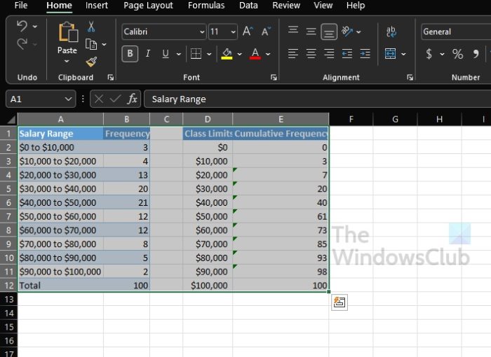
- Select the data set on the Excel spreadsheet
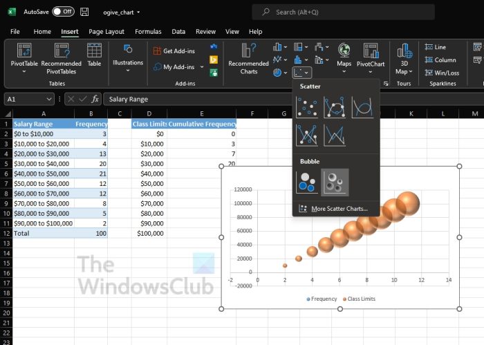
- Add a bubble chart to your work
Select the data set on the Excel spreadsheet

It is now time for us to discuss how to create a bubble chart that will deliver information based on the data already added to the spreadsheet.
- Launch Microsoft Excel if you haven’t done so already.
- Open the workbook with the relevant data from the main menu.
- Select the data set for your bubble chart.
Add a bubble chart to your work

- Click on the Insert tab right away.
- From there, you must seek out the Chart category located on the Ribbon.
- Hover the mouse cursor over the icon with the tiny dots.
- Click the icon.
- From the dropdown menu, you will see a list of bubble chart options to choose from.
- Select the one that best fits your needs.
Your bubble chart should now appear similar to that of a small window on your spreadsheet. The option is there to move it around if the placement is not to your liking.
How to customize the Bubble Chart in Excel
In terms of customizing the bubble chart, this is a fairly simple task as well. Then again it all boils down to what you want to accomplish.
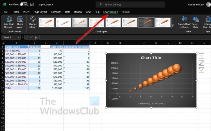
- The Design tab
- The Format tab
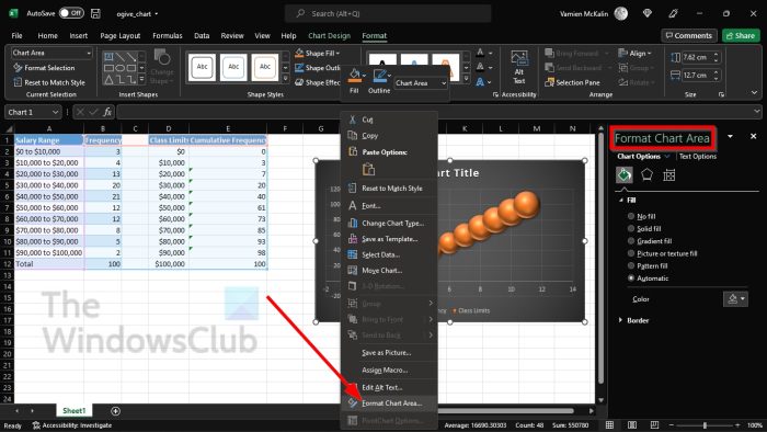
- Format Chart Area
- Chart Format buttons
- Make changes to the chart data
1] The Design tab

- Click on the bubble chart to select it.
- After that, you must click on the Chart Design tab above the Ribbons.
- From here you can apply a different layout, switch the rows and columns, add a new style, and more.
2] The Format tab
If you want to change the color, add WordArt, insert shapes, and more, then the Format tab is your friend.
- To find it, click on the bubble chart.
- From the tab, you will Format sitting next to Chart Design. Select it.
- All the options available to you are located on the Ribbon.
- Choose the options that make sense for your overall formatting needs.
3] Format Chart Area

Another formatting option available to users is the Format Chart Area. It contains quite a few options, many of which are perfect for advanced Excel users.
- Right-click on the bubble chart.
- Via the context menu, click on Format Chart Area.
- From this area, you can color and text options.
- Alternatively, folks can apply glow, shadow, border color, and much more.
4] Chart Format buttons
For additional formatting options to spice up your bubble chart in Excel, you can make use of the format buttons.
- Click on the bubble chart to select it.
- From the side, you should see three buttons.
- They are called Chart Elements, Chart Styles, and Chart Filters.
Each option brings something unique to the table, so play around with them to find what changes you can make to the chart.
5] Make changes to the chart data
If you are not pleased with the data on your Excel bubble chart, then we would recommend performing an edit.
- Right-click on the data in the bubble chart.
- From the context menu, then, you must choose Select Data.
- Make the relevant changes, but ensure you know exactly what you’re doing.
Read: How to use the ISEVEN function in Excel
Are Bubble Charts available in Excel?
From our understanding, bubble charts have been in Excel for quite some time, but in the latest version, these types of charts are easier to add and customize.
What is a bubble chart in Excel used for?
A bubble chart is used in Excel when a person wants to graphically represent three sets of data. Now, out of the three data sets used to create the bubble chart, two-axis of the chart in a series of XY coordinates are shown. After that, a third set shows the important data points.
Leave a Reply