One can easily determine the trend that emerges from the existing data by adding a Trendline to it. Microsoft Excel features this tool. As such, it can show predict the general pattern and the overall direction of your data. Let us walk you through the steps to add a Trendline in Office Excel.
How to add a Trendline in Excel
A trendline in Excel is a line that shows a general trend (upwards/downwards or increase/decline). Thus, it can help in a quick interpretation of the data. The trendline in Excel can be added to a variety of charts, including bar charts, line charts, scatter plots and more.
Let’s quickly get you through the process of-
- Creating a chart
- Adding a trendline
- Formatting a trendline
- Adding a moving average line.
Please note that the steps in this post apply to Office 2019/2016/2013 versions.
1] Creating a chart
Enter the data for which you want to create a chart.
Next, select the data and choose ‘Insert’ tab.
Scroll through the category of ‘Recommended Charts’ and click any chart to get a preview of the data (If you don’t see a chart you like, click All Charts to see all the available chart types).
2] Adding a trendline

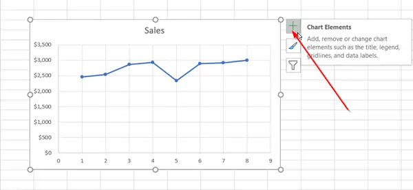
After having created a chart, select it, and hit the ‘+’ icon visible adjacent to the chart.

Scroll down the list of options and select ‘Trendline’.
Click the side arrow to view more options and choose the desired option.
Please note that Excel displays the Trendline option only when you select a chart that has more than one data series, without selecting a data series.
3] Formatting a trendline
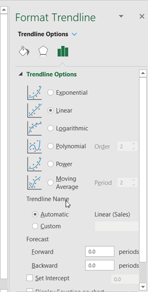
Again, press the ‘+’ sign, choose ‘Trendline’, scroll down and select ‘More options’
When the Format pane becomes visible, select the trendline option in the dropdown list.

By default, Excel inserts a linear trendline. However, you can add other variations of your choice like,
- Exponential
- Linear
- Logarithmic
- Polynomial
- Power
- Moving Average
Set a value in the Forward and Backward fields to project your data into the future. Formatting a trendline is a statistical way to measure data.
4] Add a moving average line
If you feel like formatting your trendline to a moving average line, you can do so. For this,
Click anywhere in the chart.

Switch to the ‘Format’ tab, and under its ‘Current Selection’ group, select the trendline option in the drop-down list.
Next, click ‘Format Selection’ option.

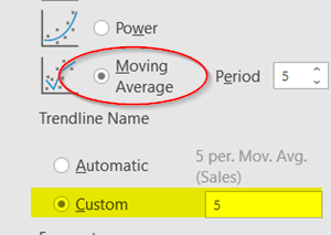
Then, from the Format ‘Trendline‘ pane, under ‘Trendline Options‘, select Moving Average. Specify the points if necessary. (Kindly note that the number of points in a moving average trendline equals the total number of points in the series less the number that you specify for the period).
This way, you can add a trendline to an Excel chart and add more depth in its information.
Now read: How to remove Metadata from Excel spreadsheet.