InDesign is a layout software for desktop and publishing. If used in collaboration with Illustrator and Photoshop, it can be used to create printed and e-books. InDesign can be used to do simple artwork by itself and learning how to add an image to text in InDesign can be a useful skill.
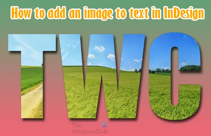
Adding an image to text is easy to do in InDesign. This can be used to decorate text instead of adding colors or pattern. The image added can be a visual way to express what the text is. For example, you can place the image of a sunny day in the word summer. You can choose to place an image in one letter in a word or all the letters in a word. Keep reading as I demonstrate how easy it is to add the image to the text in InDesign.
How to add an Image to Text in InDesign
- Open a new document in InDesign
- Add the text to the document
- Format text to your satisfaction
- Vectorize the text
- Remove fill color from the text
- Place the image in the text
- Resize the image if you need to
- Save
1] Open a new document in InDesign
The first step in the process is to open InDesign then open a new document that you will be working in. it may be that you already have a document that you were working on, and you just want to add this decorated text to it. whatever the case is you will need to open InDesign then open the document.
Find the InDesign icon and click it to open the InDesign app.
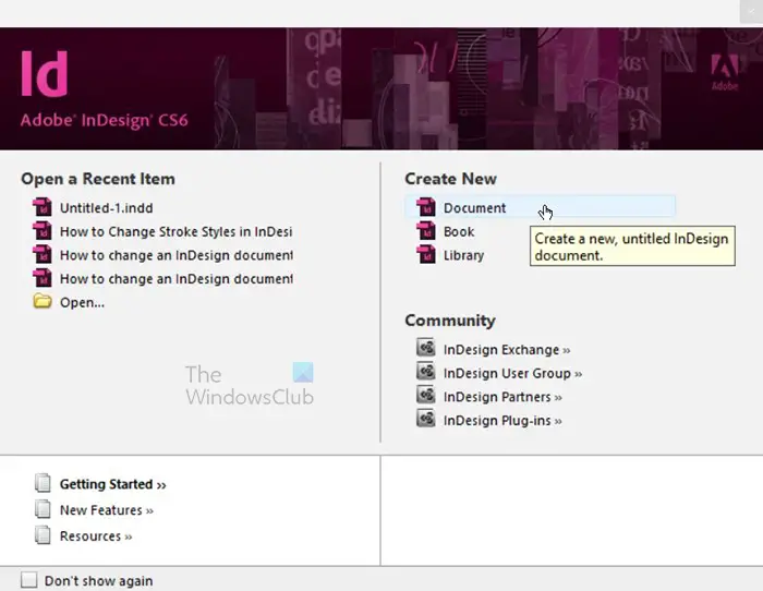
The New document window will open for you to choose if you want to open a New document, New book or a New library. You can also go to the Open a recent section to open a document that you were working on previously. In this article, a new blank document will be used so click Document under Create new.
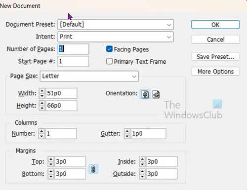
When you press Document it will bring up the window where you can choose the properties that you want for the new document. Enter the properties that you want or use the default properties that are already there. Since the article will consist of just one word, I want it to be big and clear. This means I will change the orientation of the page from the default of Landscape to Portrait. This will make the length of the page longer than the height. You could also have changed that orientation by just changing the size of the sheet to make the width wider than the height. When you are finished press Ok. When you press Ok you will see the document created with the options that you chose.
2] Add the text to the document
This step is where you will add the text to the document that you have open.
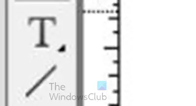
To add the text, go to the left tools panel and click the Type tool or press T. The Type tool is the T above the Line tool. With the Type tool selected click on the document and drag to create the type area that you want. Remember that you can resize it later. When you have dragged and then released the mouse button, you will see the text area created and the cursor at one end blinking.
The cursor may be small or big and that size represents the size of the text that will be created. If you want a bigger or smaller text to start with, go to the top menu bar and click the Font size value box and type in the size of the font you want or click the drop-down arrow and click a default font size. The largest default font size is 72 pt. You can choose and then manually resize when the text is created.
3] Format text to your satisfaction
Type the text and then choose an appropriate font style. You want the image to show properly so choose a font that is bold and will have a good surface area so that the image will be displayed properly.
![]()
The font chosen is Poplar std but you can choose whatever font you want or even download a font from a trusted source. The above image shows the font as it was written. You will need to format the text to what you want, you can adjust the space between letters to make them closer or further apart.
![]()
To change the space between the letters, select the word or the parts of the word where you want the letters to be closer or further apart then go to the top menu bar and enter the value in the Tracking value box.
To make the letters further apart choose a positive number and if you want the closer together choose a negative number. When you change the tracking, you will notice that some of the letters will be closer or further apart than some, you can choose to select those individually and change the tracking for them.
![]()
The tracking on the words above is -25, you realize that the letters are closer and two letters are touching. You can select those two letters and change the tracking for them, or they can remain that way. In some cases when the word is resized the letters will gain more space between them.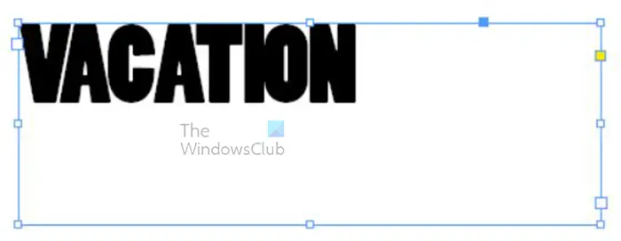
If you want the word to be bigger, click on the frame around the word or letter. If you are still in the type mode just click on the Select tool to turn off the type mode. You can then click on the text or the frame around the text and you will see handles appear around the word.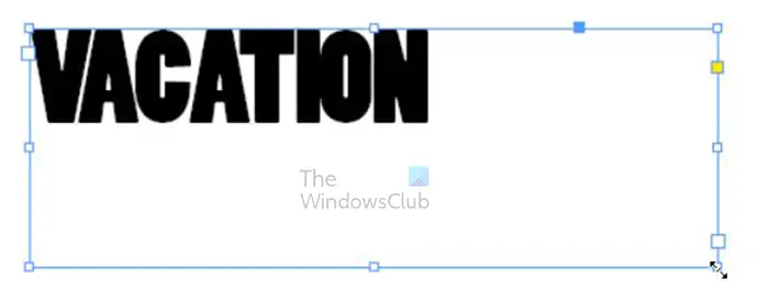
Click on any of the handles and hold Shift then drag to resize the text frame.
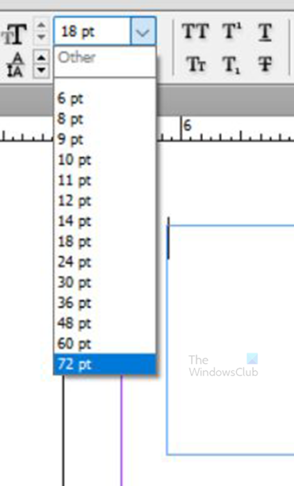
You will then click the Type tool or double-click on the word to go in type mode, you then select the whole text and go to the top menu bar and type in the font size that you want. If you did not resize the frame around the text the font may Wrap or become hidden inside the text frame.
4] Vectorize the text
This step is where you will vectorize the text. Before vectoring the word or just the letter that you want to add the image to, ensure that it is the right font style. When the text is vectorized you will not be able to make certain changes.
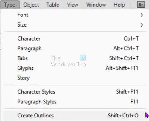
To vectorize the text select it then go to the top menu bar and click Type then Create outline or press Shift + Ctrl + O. when you click Create outline you will see the text adjust and the edges around the letters change somewhat. The text is now converted to a shape, this means that you will not be able to make any changes to the individual letters.
If you do not want to have to create the text form start in case you made a mistake, you could always make a copy and place it off to the side of the document or turn off its visibility. This way if there is an error with the font style or spelling, you can always have the word already created.
5] Remove fill color from the text (Optional)
In this step you will remove the fill color from the text. this means that you will remove the color so that the text will be an outline. This step is optional and because when you add the image to the text the image will take the place of the color on the text. The advantage of removing the fill is that if the image does not cover the entire text, there will be no fill color showing in the empty spots. However, having fill color showing where the image does not cover can be a nice way to be creative.
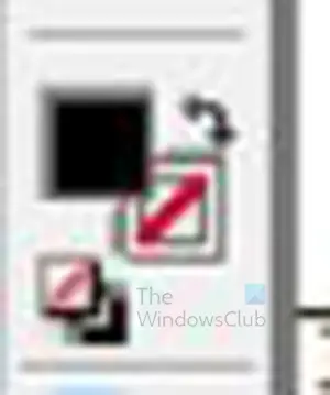
To remove the fill color, select the text and go to the left tools panel and look for the Foreground and Background color tool, it is two squares with one a little higher than the other. The higher one controls the fill color and the lower one controls the stroke color, click on the fill color icon.

This is the word with the black color.
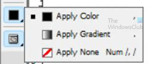
Look below for a color swatch with a small arrow beside it, click and hold the arrow until a pop out menu appears. When the menu appears click Apply none.

When you click Apply none, you will see the color disappear from the text.
6] Place the image in the text
This step is where the image is placed in the text.

This is the image that will be placed inside the text.
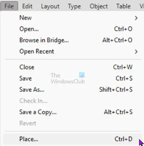
To place the image in the text, select the text and go to the top menu bar and press File then Place or press Ctrl + D.
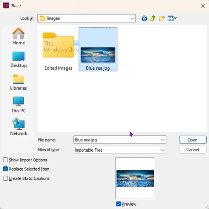
The Place window will open for you to choose the image to place in the text. Select the desired image, then click Open.

The image will be placed inside the text as shown here. This image was larger than the text, so it filled it up. However, if the image was smaller than the text, it would leave uncovered spaces in the text.
7] Resize the image if you need to
In this case, where the text is not fully covered, the image will have to be adjusted. In this case, where the image is large, you want to show more of the other aspects of the image, so adjusting the image is essential.
To adjust the image within the text hover over the image until you see a circle in the middle of the image. Click the circle, and you will see the outline of the image. You are now able to click the circle and move the image around without moving the text.
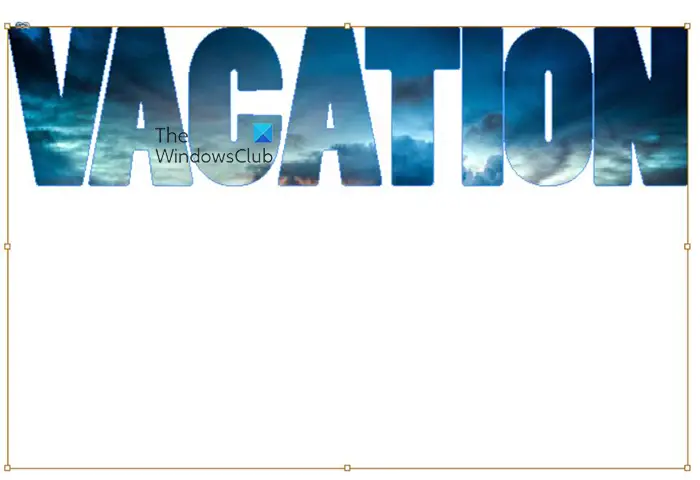
You can also click any of the handles and resize the image without affecting the text. remember that if you want to resize proportionately from all sides, hold Shift + Ctrl while you drag any of the handles.

This is the image adjusted inside the text. you will notice that you are able to see more of the image inside the text.
8] Save
The next step is to save your hard work. Your first save is to save the document so that it can be edited if you need to. To save it so that it is editable, go to File, then Save as. When the save as window appears. Choose the save location, then choose a name for the document and click Saves.
Now it is time to save as a file format that is good for sharing and using online. When you are finished working on the file go to File then Save as. When the Save as window appears, choose the file format that you want. You should choose a file format such as JPEG or PNG.
Read: How to create custom shapes in InDesign
How can I add an image to a single letter in a word?
The steps to adding the image to a single letter in a word are the same process as adding the image to a word. However, in this case, you will type the two sections separately. You would write the letter with the image placed in it, separate from the rest of the text.
The letter with the image placed in it should be converted to a vector, while the rest of the text would remain as text.
The next step would be to click the letter and go to the top menu bar and click File then Place to bring up the Place window so that you can choose the image file. Click on the image then click Ok.
The image will be placed inside the letter and not the whole text. You can then adjust the image inside the letter as you want.
What is Tracking in InDesign?
Tracking refers to the space between letters in a text in InDesign. The space between the letters can be increased or decreased depending on what you want for your design. To increase or decrease the space between the letters go to the type tool or double-click the text to enable the Type tool, with the type tool active, select all the letters. Go to the top menu bar and type the number for the space that you want between the letters. Type a positive number to increase the space or a negative number to decrease the space.
Leave a Reply