Microsoft Office programs such as Word, Excel, and PowerPoint are known to create charts, but did you know that Microsoft Access also creates charts as well, although it is a database program? Charts help individuals to understand the data displayed before them more due to it being graphical. In this tutorial, we will explain how to create a bar chart in Microsoft Access.
How to create a Bar Chart in Access
Follow the steps below to create a Bar Chart in Microsoft Access.
- Launch Microsoft Access.
- Type in your data or use existing data.
- Click Insert Modern Chart.
- Hover the cursor over Bar Chart and select Clustered Bar.
- Draw the chart onto the grid.
- Select any of the sources in the Data Source section.
- select the Format tab and choose the options you want.
- Choose a Series Fill Color and a Series Border Color.
- Check the checkbox for Display Data Labels.
- Press F4 to open the Property pane.
- Select the white color for Primary Vales Axis Font Color.
- Select the white color for Chart Title Font Color.
- Close the Property pane and Chart Settings pane
- Click View and select Form View.
- Right-click the Form tab and select save. Name the Form and click OK.
- Now we have a Form containing a chart.
Launch Microsoft Access.
Type in your data or use existing data.
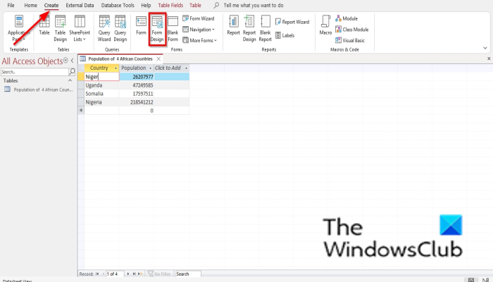
Click the Create tab and select Form Design from the Forms group.
It will open on the Form Design pane.
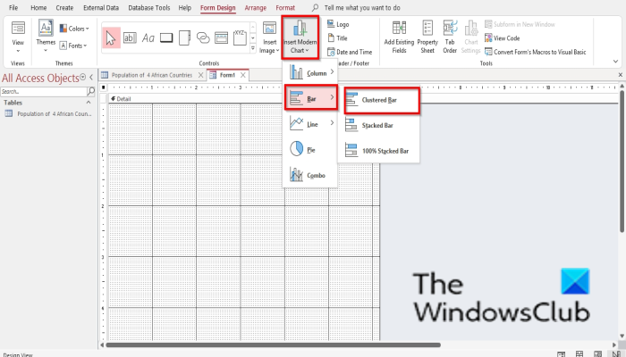
Click the Insert Modern Chart button.
Hover the cursor over Bar Chart and select Clustered Bar.
Now you will see a mini plus sign with a chart. Draw it onto the grid.
A Chart Settings pane will appear on the right.
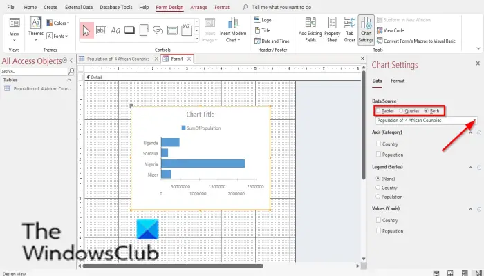
In the Data Source section, you will see options, Tables, Queries, and Both. These options represent where you want the data to come from. In this tutorial, we choose Tables because the data we want to turn into a chart is in a table.
Now choose the table from the list box.
Below are the Axis (Category), Legend (Series), and Values (Y axis). We do not want any more changes to the chart, so we leave these sections alone.
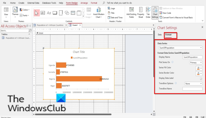
Now select the Format tab. In the Format tab, there is the Data Series section. You select a data series from the list box if you have more than one series in the chart.
In the Format Data Series section, you can change the name of the Data Series, and change the Plot Series on, Series Fill Color, Series Border Color, Display Data Labels, Trendline Options, and Trendline Name.
Select the options you would desire.
If you want to add data labels to your chart, check the checkbox for Display Data Labels.
Data labels will appear on your chart.
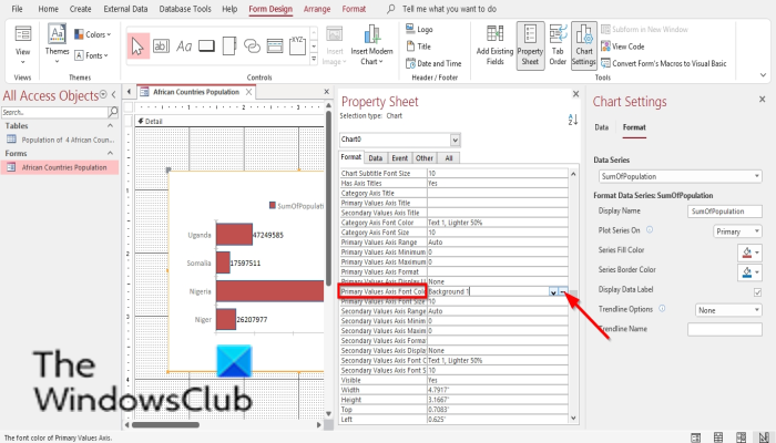
Press F4 to open the Property pane and click on the blank row of Primary Values Axis Font Color. Click on the white color, which is Background 1.
You will notice that the primary axis is no longer visible anymore.
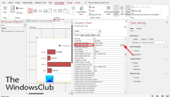
On the Property pane, scroll up to Chart Title Font Color and click the blank area of that same row. Click the dots and select the White color, which is Background 1.
Close the Property pane and the Chart Settings pane.
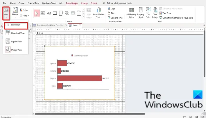
Then click View in the Form group and select Form View to see how the form would look.
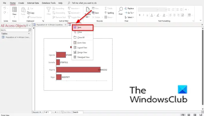
To save the form, right-click the Form and select Save.
A Save As dialog box will open. Name the Form and click OK.
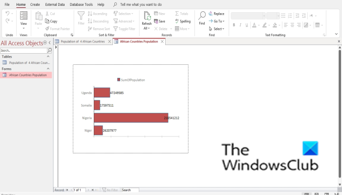
Now we have a chart in a Form.
Where can I make a bar chart?
You can make Bar Charts in Microsoft Office programs such as Microsoft Word, Excel, PowerPoint, Outlook, and Access. In Microsoft Word, PowerPoint, and Excel, you will have to gain access to Bar Chart on the Insert tab and select the Chart button. In Outlook, to gain access to the Chart feature, open the New Mail interface and select the Insert tab. To gain access to Bar Charts in Microsoft Access, you must create a Form design and a Report Design.
Is Access better than Excel?
When it comes to managing databases, Access is better. Access helps to keep data organized and is to search. Excel is better for analyzing data, performing complex calculations, exploring possible Outcomes, and producing high-quality charts.
That said, Excel is easier to learn than Access. Access is more complex than Excel. Access is a program that is made to manage databases, and some people find it quite hard to learn, but with practice, users can master it.
READ: How to Sort and Filter Records in Microsoft Access
We hope this tutorial helps you understand how to create a Bar Chart in Microsoft Access; if you have questions about the tutorial, let us know in the comments.
READ: How to Hide or Unhide Fields and Rulers in Microsoft Access