A Chart is a graphical representation of data, such as a pie chart, bar graph, line graph, etc. Charts can make the information interesting, appealing, and easy to read for your audience.
What is a Progress Chart?
A Progress Chart is a graphical representation of the degree of completion of work in progress. Progress charts help individuals to monitor their objectives and provide critical data for strategic decision-making.
How to Create a Progress Chart in Excel
Follow the tutorial below to create a Progress Chart in Excel.
How to Make a Progress Bar Chart in Excel
Follow the steps to create a Progress Bar Chart:
Launch Excel.
Enter some data on your spreadsheet or use existing data.
Highlight the data range.
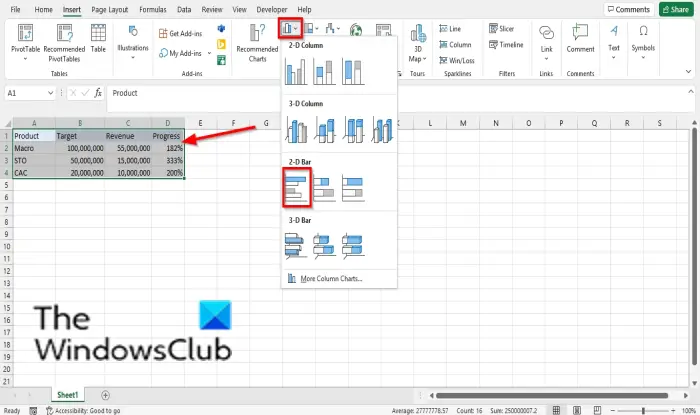
Click the Insert tab.
Click the Insert Column or Bar Chart button in the Charts group and select the Clustered Bar under the 2-D Bar from the menu.
The Clustered Bar will appear on the spreadsheet.
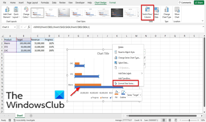
Click the Switch the Rows/Column button to place the Product column in the table on the vertical axis.
The Product column will switch to the vertical axis, and the other columns will switch to the legend entry on the chart.
Right-click the Target data series and choose Format Data Series from the context menu.
A Format Data Series pane will appear on the right.
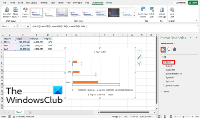
Click the Fill and Line tab.
Click Fill, then click No Fill.
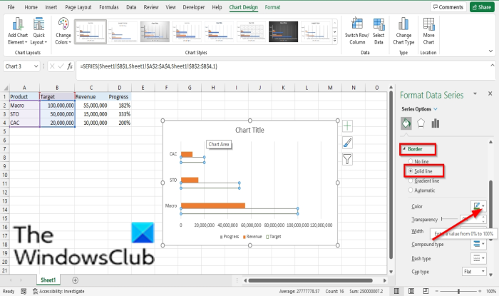
Click Border and select Solid Line.
Then choose a color for the border of the no-filled bar.
Close the Format Data Series pane.
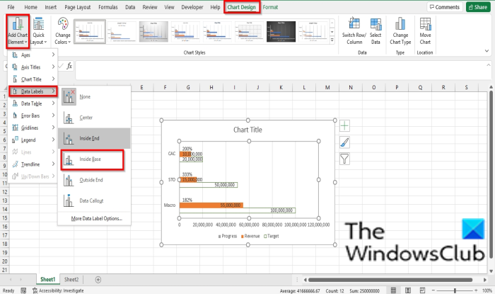
Click the chart plot area and then click the Design chart tab.
Then, click the Add Chart Element button, hover the cursor over Data Labels, and select Inside Base.
All the data series is inserted into the bar chart.
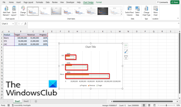
Delete all data labels inside the bar chart’s bar except the percentage.
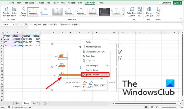
Right-click the Target data series again, and choose Format data series from the context menu.
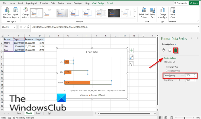
Under Series, options set the Series Overlap to 100%.
Click the horizontal (value) axis.
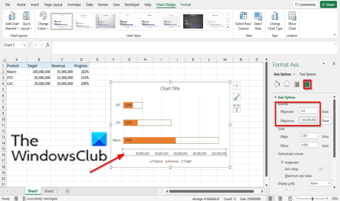
On the Format Data Series pane on the right, click the Axis Options button.
Set the Maximum target value for your chart in the Maximum entry box.
Close the Format Data Series pane.
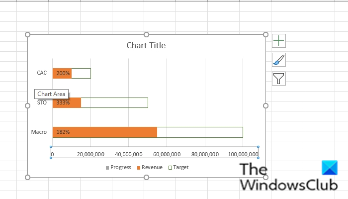
Now we have a Progress Bar Chart.
How to make a Progress Circle Chart in Excel
Launch Excel.
Enter some data on your spreadsheet or use existing data.
Highlight the data range.
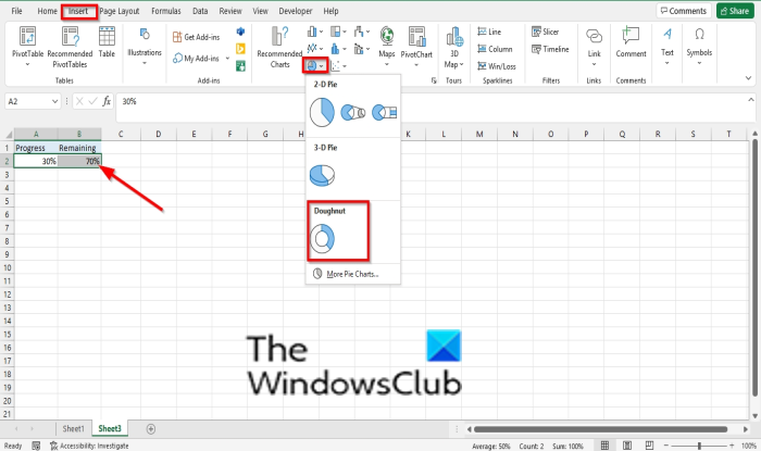
Click the Insert tab.
Click the Insert Pie or Doughnut chart button in the Charts group and select Dougnut from the drop-down menu.
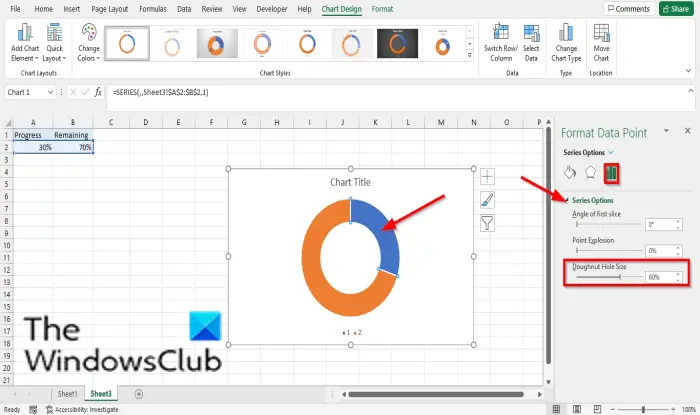
Now we are going to resize the doughnut chart hole size.
Double click any of the doughnut slices; for instance, we will double series 1 point 1.
The Format Data Point pane will appear on the right.
On the Series Options tab, under Series options, set the Dougnut hole size to 60%.
Now we are going to recolor the slices of the doughnut chart.
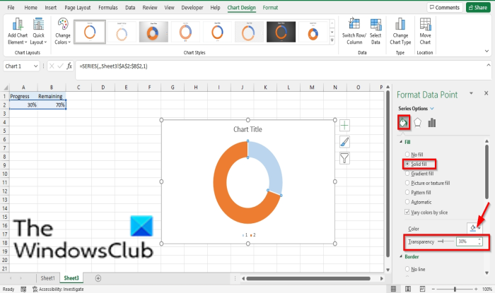
Still, on the series 1 point 1 slice, click the Fill and Line tab on the Format Data Point pane.
Under Fill, click Solid Fill.
Then choose a color.
Set the Transparency to 30%.
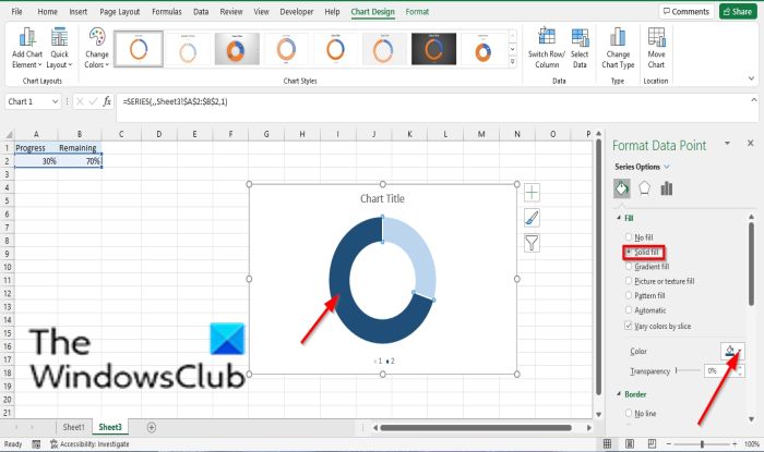
On the chart, double click the series 1 point 2 slice to customize the series 1 point 2.
Still, on the Fill and Line tab, click Fill, then click Solid Fill.
Choose a color.
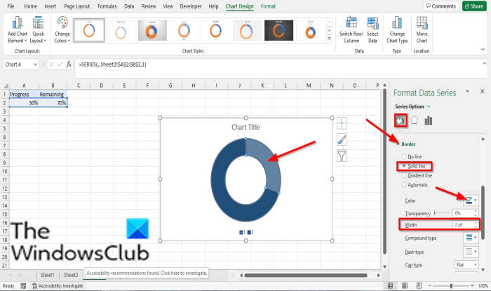
Click the plot area on the chart, then click a slice to select both series 1 point 1 and series 1 point 2.

Then click the series 1 point 1 slice and select the Fill and Line tab on the Format Data Series pane.
Click Border, select Solid line, and choose a color.
Also, under Border, set the width to 2pt.
Close the Format Data Series pane.
Now, we will add a textbox to the chart.
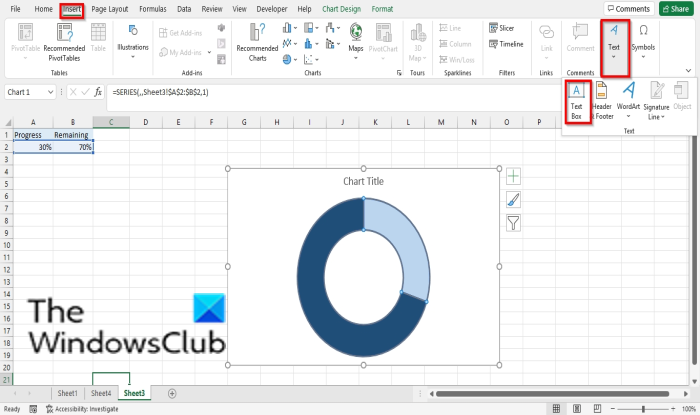
Click the Insert tab.
Click Text and select a text box.
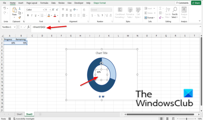
Draw the text in the hole of the doughnut circle.
Type = A2 into the formula bar and press enter.
Adjust the size, weight, style to your taste.
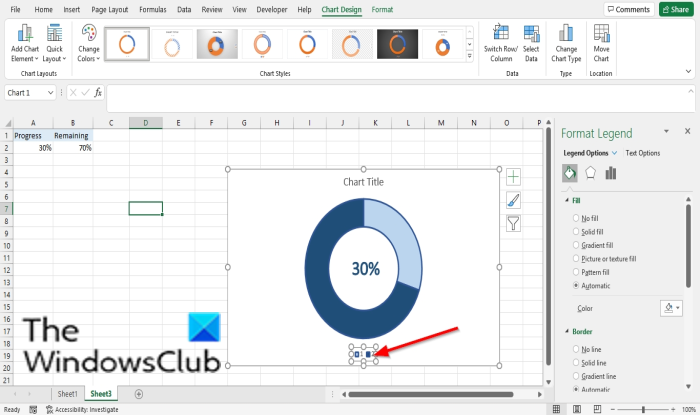
Delete the legend entry.
Now, we have a progress circle.
Read: How to create a Half Pie Chart in Excel.
We hope this tutorial helps you understand how to create a progress chart in Microsoft Excel; if you have questions about the tutorial, let us know in the comments.
Leave a Reply