Microsoft Excel is a program known to be advanced in creating charts, you can use predefined charts or create your own Excel charts for your presentation, but did you know that you can add a crayon effect to your charts to make them look like a sketch? In this tutorial, we will explain how to create a chart with the crayon effect in Excel.
How to create a Chart with Crayon effect in Excel
Follow the steps below on how to create a chart with crayon effect in Excel:
- Open Excel spreadsheet
- Insert Chart
- Add shape and convert it to a picture.
- Add effects to the rectangle.
- Add crayon effect to chart
- Change the background color of the chart area
Let us look at the steps involved in detail.
Insert Chart
Launch Microsoft Excel.
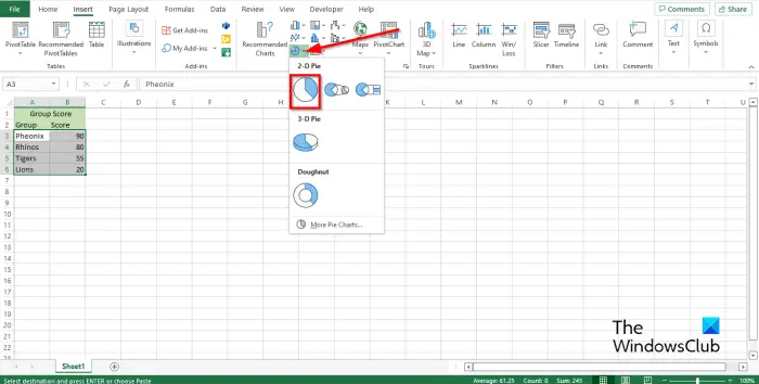
- Highlight the data you want to include in your chart from the table.
- Click the Insert tab.
- Click the Pie Chart button in the Charts group.
- Select the Pie Chart in the 2-D section.
- The Pie Chart is inserted into the spreadsheet.
Add shape and covert it to a picture
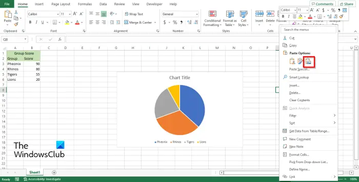
- Click the Insert tab.
- Click the Shape button in the Illustration group and select a rectangle from the menu.
- Draw the rectangle on the Spreadsheet.
- Now we are going to cut the rectangle shape from the spreadsheet.
- Press the Ctrl X keys to cut the rectangle.
- Then right-click the spreadsheet and select Picture under Paste Options in the context menu. This saves the rectangle as a picture.
Add effects to rectangle.
Now that the rectangle is converted to a picture, you can now have access to the Picture Format tab.
Ensure that the rectangle is selected.
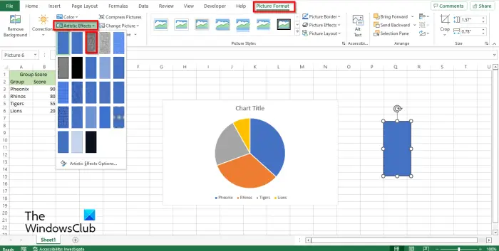
Go to the Picture Format tab and click the Artistic button in the Adjust group.
Choose the Pencil Greyscale option from the menu.
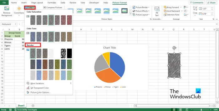
Now click the Color button in the Adjust group.
In the drop-down menu, in the Recolor section, select the color you want.
Add crayon effect to chart
Now we are going to copy the rectangle picture to the clipboard.
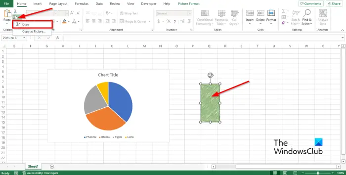
Right-click the rectangle, then go to the Home tab and click the Copy button.
Select Copy from the menu.
Now it is copied to the clipboard.
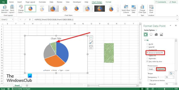
Now, right-click the chart’s data point and select Format Data Point from the menu or double-click the data point on the chart.
A Format Data Point pane will appear.
Click the Fill and Line button.
Click the Fill section and select the Picture or texture fill option, then click the Clipboard button under Picture Source.
You will notice that one of the slices of the Pie Chart as the crayon effect.
It will have the crayon effect because you have formatted the data point of that slice.
To turn the other slices of the Pie Chart into a crayon effect, follow the same procedure in the tutorial.
Change the background color of the chart area
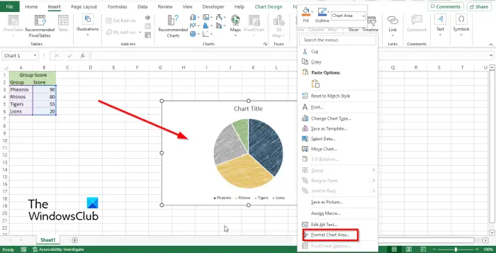
Right-click the chart and select the Format Chart Area option from the context menu.
A Format Chart Area pane will open on the right.
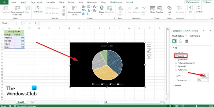
Click the Fill and Line button.
Under the Fill section, click Solid Fill.
Then choose a color.
The Chart Area background will change to the color you have selected.
What is a 2D pie chart?
A 2D pie chart displays a circle that is divided into sections that represent a particular data; it shows proportions as a whole. The 2D Pie Chart is used when numbers equal 100% and should be used if the chart has a few pie slices.
How do you customize a chart?
If you want to customize your charts, you can do so by clicking the Chart Design tab on the menu bar that contains features to assist you in customizing your charts style, color scheme, layouts, etc. You can also right-click your chart to customize the charts Data Points, Data series, and Legend from the context menu.
Read: How to change Layout and Chart Style in Excel
What are chart elements in Excel?
Excel Chart elements are everything in the chart except the series and the chart area. Chart elements in a chart are the data labels, axis, axis titles, chart titles, legends, error bars, gridlines, etc.
How do I create a pie chart in Excel with percentages?
Follow the steps below to create a pie chart in Excel 2010:
- Right-click any slice on the chart and select Format Data Labels from the context menu.
- On the Format Data Labels pane, select the Value or the Percentage box or both.
Read: How to create a Lollipop Chart in Excel
We hope you understand how to create a chart with crayon effect in Excel.