A Combination Chart is used to showcase one chart above the other using the same scale by percentage. The Combination Chart is also called Combo Charts. Combination Charts allow the reader to study data to determine if there is a relationship between the two data sets. In Microsoft Excel, when creating a graph, it generally has an X-axis and a Y-axis, but with a combination graph, there are two Y-axis which allows the user to have two different types of data points in the same chart.
Excel users use combination charts if the values from one series are too large or small compared to the other data. Combination charts also enable users to review large data sets with multiple data tables and show the numbers in an orderly manner in one chart. The Combination Chart shows two chart types, columns and lines, on the same chart.
How to create a Combination Chart in Excel
Open Microsoft Excel.
Create a table or open an existing table.
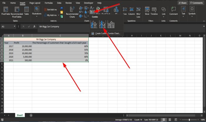
When creating a Combination Chart, the first thing you need to do is highlight the entire table.
Then go to the Insert tab and click the Combo Chart button in the Charts group.
In the drop-down list, you can select the type of combo charts you want.
The types are Combo Charts displayed in the list is used to highlight different kinds of information. These Combo Charts are:
- Clustered Column -Line: This Chart type is used when you have mixed types of data.
- Clustered Column -Line on Secondary Axis: This chart type is used when the chart’s range varies widely and has mixed data types.
- Stacked Area – Clustered Column: Like the Clustered Column -Line, the Stacked Area – Clustered Column is used when you have mixed types of data.
Hovering your cursor over the Combo Chart or Combination Chart types will display a preview on your spreadsheet.
Select the Clustered Column -Line on Secondary Axis; this chart type showcase the perfect description to compare the relationship between the two data.
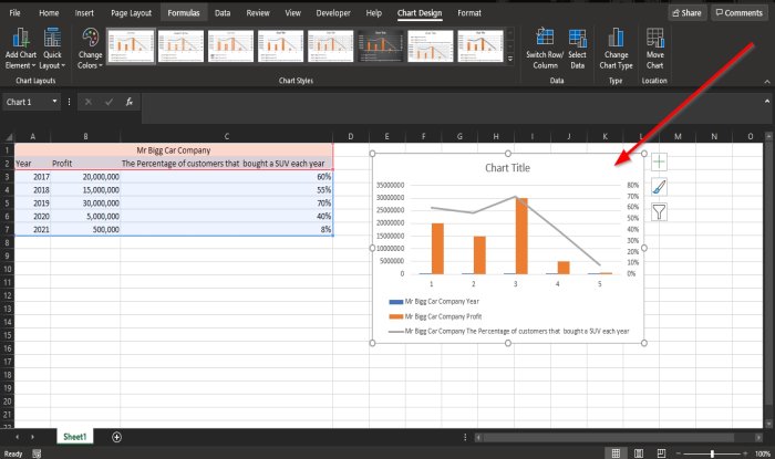
Once selected, you will see the chart with columns and lines comparing the two data on your spreadsheet.
Read: How to insert Excel spreadsheet in OneNote.
Create a Custom Combo Chart in Excel
You can even create a custom Combo Chart.
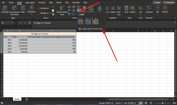
Click the Combo Chart button, click Create Custom Combo Chart.
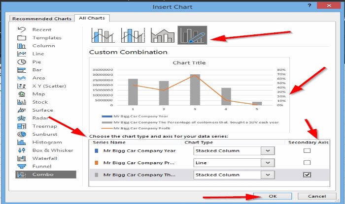
An Insert Chart dialog box will appear.
In the dialog box above, click the Custom Combination button
Under the section, choose the chart type and axis for your data series; in the Chart Type category, you can choose to customize the chart by clicking the list boxes below and selecting the options you need in the chart.
Under the Secondary Axis, click the last checkbox.
A preview of the Custom Combination Chart will be previewed in the middle of the dialog box.
Then click OK.
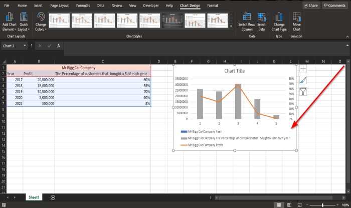
Now we have a Custom Combination Chart.
We hope this tutorial helps you understand how to create Combination Charts in Microsoft Excel.
Now read: How to find the Square Root of a Number in Excel.
Leave a Reply