If you want to create a dashboard in Microsoft Excel, this post will help you. A dashboard is a type of graphical representation that depicts the key performance indicators for a particular topic or business process. It helps in analyzing the trend, monitoring KPIs, tracking the budget, and doing much more by just looking at it. It contains graphs and tables that represent live data. Now, if you want to make an Excel dashboard, you can use this step-by-step tutorial.

Can you use Excel as a dashboard?
Yes, you can definitely create an Excel dashboard to show and analyze key data points in one place. You can find a lot of chart types in Excel that you can use to make a whole dashboard of data representation in your Excel workbook. There is certain pre-requisite knowledge that you need to be particular about. These include:
- What is the main goal and purpose of your dashboard?
- The dataset you are going to use for your dashboard.
- Who is your target audience?
- What data points do you want to monitor?
- What kind of charts do you want to use?
Once you are clear of the above points, you can easily create an Excel dashboard on Windows. Now, there are two different ways to create a dashboard in Excel. Let us discuss these two methods.
How to create a Dashboard in Excel that updates automatically
There are two methods to create an analytical dashboard in Excel that updates automatically using a pre-designed template or from scratch on your Windows 11/10 PC:
- Use an existing dashboard template and edit it accordingly.
- Create a dashboard from scratch.
1] Use an existing dashboard template and edit it accordingly
The first and easiest method to create a dashboard in Excel is to use a pre-designed template. You can find a Semi-monthly home budget dashboard template in Excel that you can use to do the same. Apart from that, you can also search for dashboard templates for Excel online, download them, import them into Excel, and then edit them.
To use the Semi-monthly home budget dashboard template, go to the File menu and click on the New option.
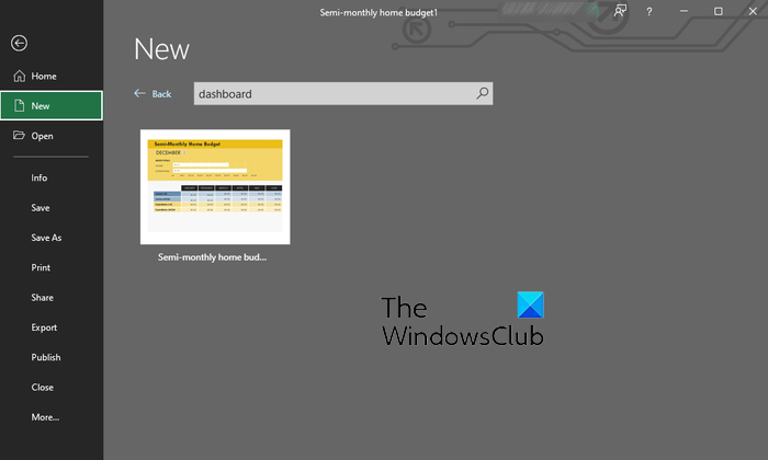
After that, type and enter “dashboard” inside the Search for online templates box and it will show you the Semi-monthly home budget dashboard template. Click on the template and then press the Create button.
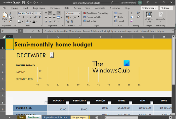
You can now edit the data sets, make other modifications, format and stylize the content, and update the dashboard as per your requirements.
Read: 10 useful fFree Project Management Templates for Excel.
2] Create a dashboard from scratch
If you want to create an Excel dashboard manually right from scratch, here is a step-by-step procedure you can follow:
- Create or import your dataset.
- Clean up your dataset.
- Add multiple worksheets to set up your workbook.
- Set up the main goal for your dashboard.
- Analyze your data.
- Choose the chart type that suits your requirement.
- Filter your data in the Chart Data worksheet.
- Build a chart.
- Select the chart.
- Customize the chart.
- Add more charts to create a dashboard.
- Edit your dashboard.
The very first step to creating a dashboard in Excel is to add the required data.
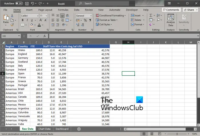
You can create the dataset from scratch or import it from an existing Excel or another supported file.
Now, once you have imported your data, you must clean up and well organize your data. You can verify the data, clear duplicates from Excel data, and make sure there is no sort of errors in your data.
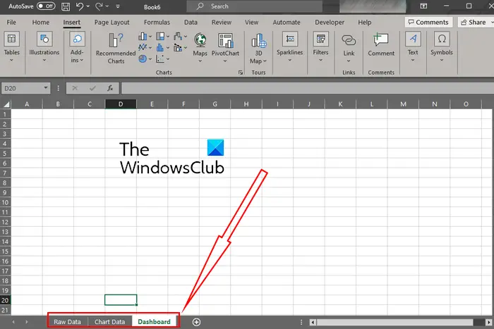
Next, you need to set up your workbook with multiple worksheets to create a dashboard. You basically need three different worksheets to generate a basic dashboard. You can name these worksheets as Raw Data, Graph/Chart Data, and Dashboard. As the name suggests, these worksheets will be having the source data, chart, and the final dashboard, respectively.
Click on the Plus button present below and add a worksheet. The Chart Data and Dashboard worksheets will be blank as of now. And, the Raw Data sheet is containing the source data that you previously created or imported.
See: How to create a Histogram Chart in Microsoft Excel?
The next thing to do is to understand what exactly you want in the output dashboard. It is important as there are numerous options to create a dashboard that can be a bit too overwhelming. So, decide the main goal of your dashboard, like showing trends, analyzing budget, etc.
Now comes the main step, which is to select the chart type that you want to use for the visual representation of your data. Excel offers a variety of charts to graph your data including line charts, bar charts, column charts, pie charts, scatter plots, waterfall charts, radar charts, sunbursts, and more. For example, a column chart will be suited for analyzing the monthly budget, a line chart can be used for analyzing trends, bar charts are effective for showing comparisons on the dashboard, and so on. So, understand your requirements and select a suitable chart type.
Read: How to create a Line Chart and Scatter Plot Graph in Excel?
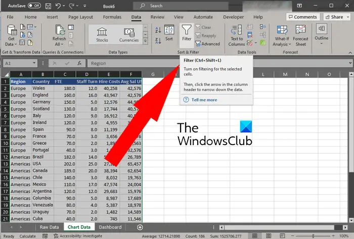
Are you going to use all of your data to represent the output dashboard? If not, you need to filter out the data that you need to show in the output dashboard. You can use the Data > Filter menu to do so. Keep the filtered data in the Chart Data worksheet.
TIP: How to use Advance Filter in Excel?
Once you are done filtering your data, you need to create a chart. For that, move to the Dashboard worksheet that you created in the third step. After that, click on the Insert menu and select the chart type that you want to build.
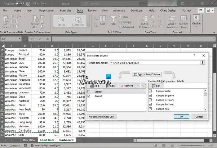
As you add a chart, you will see a blank box. This is because we haven’t selected the data to plot on the chart. So, we are going to choose the input data now. Right-click on the added chart and choose the Select Data option from the appeared context menu. Now, move to the Chart Data tab and highlight the data you want to plot. When you selected the data, press the OK button and the data will be plotted on the graph.
Next, you can customize the created chart and stylize it to make it more informative. You can edit the chart type, change the style of the chart, change the font, and format it as per your preferences.
Read: How to create Pictograph in Excel?
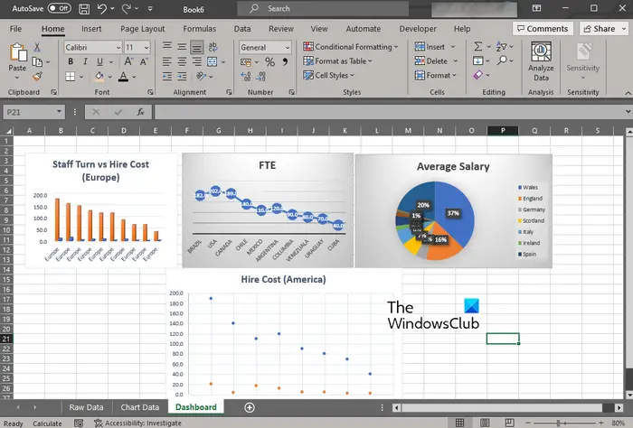
You need to repeat the above process to create multiple chart types in your dashboard. Add a chart, select the input data, and customize your chart.
When done, you can further modify your dashboard so that it looks appealing and educational. The dashboard will be updated and interactive if you use dynamic charts. So, to automatically update your dashboard, you must use a dynamic chart range as we did in this post.
That’s it. Your dashboard is now created that you can use to show trends, comparisons, and other information in one place. The dashboard can be more elaborated by adding tables and more graphs to it.
See: How to show Charts with Hidden Data Cells in Excel?
How do I create an HR dashboard in Excel?
To create an HR dashboard for enabling the HR team to monitor HR key performance indicators (KPIs) in Excel, you can use an HR KPI dashboard template. There are several free HR dashboard templates for Excel available on the internet that you can download and import to create your own HR dashboard. Besides that, you can also create an HR dashboard from scratch as we have shown in this post.
Now read: How to create a Pivot Table and Pivot Chart in Excel?
Leave a Reply