The Gauge Chart is known as a dial or speedometer chart. A Gauge shows the minimum and the maximum; it has a pointer or needle showing information as a reading on a dial. The Gauge Chart is a Doughnut and Pie chart combined. In this post, we will show you how to create a Gauge Chart in Microsoft Excel.
How to create a Gauge Chart in Excel
Launch Excel.
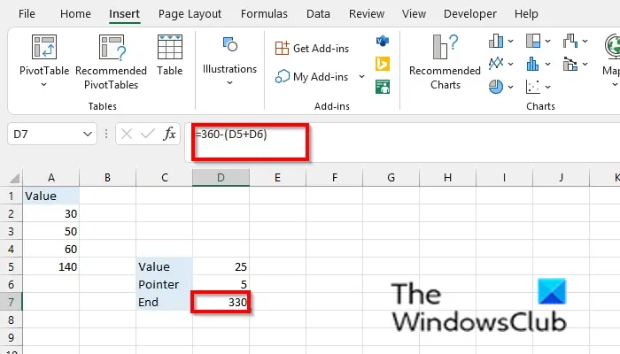
Now, we are going to create the first table called value and input data into it. See photo above
We are going to add the values 30, 40, and 60, which add to 140. See photo above
Now, we are going to make the second table, in which we will add data for the value, pointer. See photo above.
Calculate the value and pointer by using the reference =360-(D5+D6). See photo above.
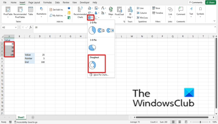
Select the data in the value table.
Click the Insert tab, click the Pie Chart button, and select the Doughnut Chart from the drop-down menu.
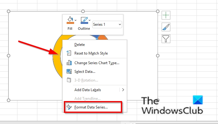
Right-click the Doughnut chart and select Format Data Series from the context menu.
A Format Data Series pane will open on the right.
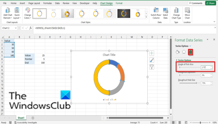
On the Series Options tab, type 271 into the Angle of first slice entry box and close the pane.
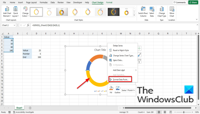
Click the largest part on the Doughnut chart and then right-click it, select Format Data Point in the context menu.
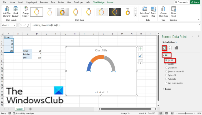
A Format Data Point pane will open on the right; click the Fill and Line tab.
Click the Fill section.
Click No Fill and then close the pane.
You will notice that the larger part of the Doughnut chart is invisible.
Right-click the Doughnut chart and click Select Data from the context menu.
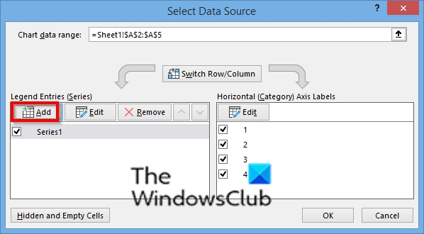
A Select Data Source dialog box will open.
Click the Add button.
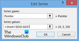
An Edit Series dialog box will open.
In the Series Name section, specify the name of the series.
In the Series Values section, input the series values ( the second table). See photo
Click OK.
Click Ok again.
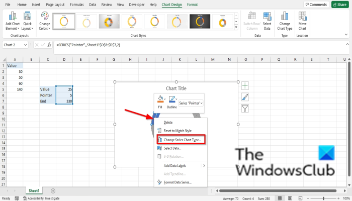
Right-click the second Doughnut and select Change Series Chart Type.
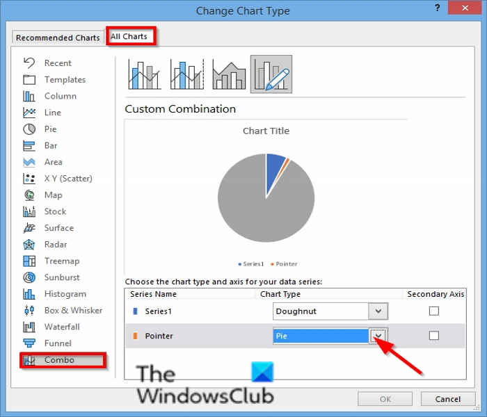
A Change Chart Type dialog box will open.
On the All Charts tab, click Combo.
Select Pie for the Series Name ‘pointer’ and click OK.
Right-click the Pie chart and select Format Data Series.
A Format Data Series pane will open on the right.
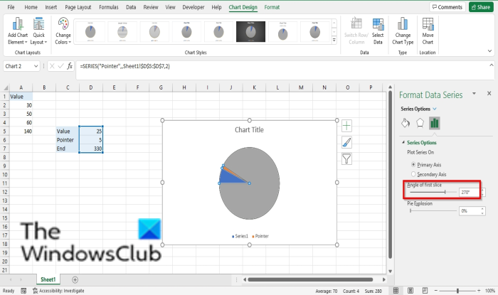
On the Series Options tab, type 270 into the Angle of first slice entry box and close the pane and then close the pane.
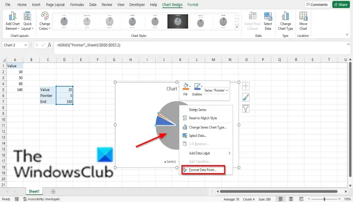
Click the largest part of the Pie chart and right-click and select Format Data Point in the context menu.
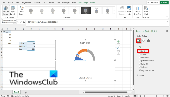
A Format Data Point pane will open on the right; click the Fill and Line tab.
Click the Fill section.
Click No Fill and then close the pane.
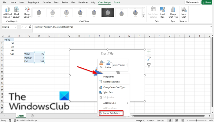
Click the largest part on the left of the chart and select Format Data Point in the context menu.
A Format Data Point pane will open on the right; click the Fill and Line tab.
Click the Fill section.
Click No Fill and then close the pane.
Remove the Chart Border, Legend, and Chart Title.
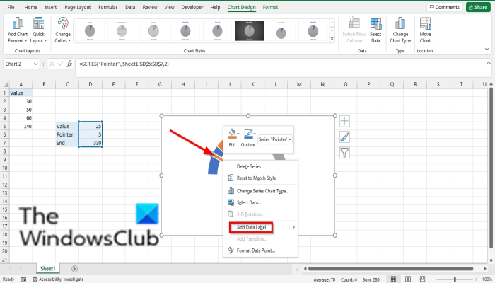
Click the pointer on the chart, right-click it and select Add Data Labels.
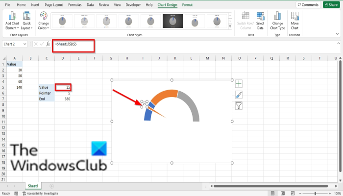
Click the label and click it again, type the = sign, and select the value from the table.
The Pointer will go to that value on the chart.
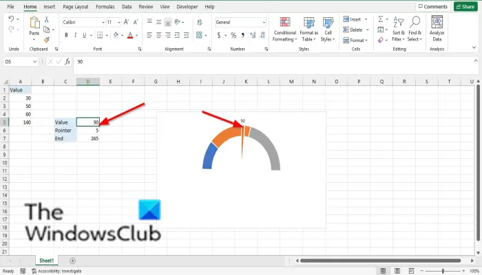
Any value you typed in the Value cell, the pointer will go to that position on the chart.
Now read: How to use the SUMSQ function in Excel.
What do you mean by a chart?
A Chart is a graphical representation of data so that people can understand the data easier and is often used to compare data in your spreadsheet. Charts are represented by symbols such as pie charts, bar charts, etc.
How many types of charts are there?
In Microsoft Excel, you have a total of 17 charts. See below: Column, Line, Pie, Bar, Area, XY (Scatter), Map, Stock, Surface, Radar, Treemap, Sunburst, Histogram, Box and Whisker, Waterfall, Funnel, and Combo.
We hope this tutorial helps you understand how to use the Gauge Chart in Excel; if you have questions about the tutorial, let us know in the comments.
Leave a Reply