Today we will see how to create a Histogram chart in Microsoft PowerPoint. A Histogram is a graphical representation that shows frequency data; it has a structure similar to a bar graph that organizes a group of data points into user-specified ranges. The purpose of the Histogram chart is to display a large amount of data and the occurrence of data values; it easily determines the median and data distribution and shows the visual representation of data distribution.
To create a histogram in Microsoft PowerPoint, you must provide two types of data, namely:
- Input data: This is the data that you want to analyze by using the Histogram tool.
- Bin numbers: Numbers that represent the intervals which you want the Histogram tool to measure the frequency.
You must organize the data in two columns on the worksheet.
What is a histogram chart used for?
The histogram chart is used to demonstrate how many of a certain variable occurs within a specific range. It is often used to illustrate the major features of the distribution of the data in a convenient form.
How to create a Histogram chart in PowerPoint
Follow the steps below to create a Histogram chart in PowerPoint.
- Launch PowerPoint
- Click Insert and click Chart
- Click the Histogram chart icon on the left pane
- Select the Histogram option
- Edit the mini Excel Spreadsheet
- Customize your Histogram chart
- A histogram chart is created
Launch PowerPoint.

Click the Insert tab on the menu bar.
Then click Chart in the Illustration group.

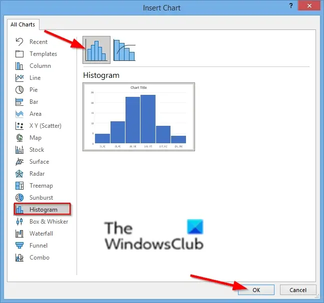
In the Insert Chart dialog box, click the Histogram chart icon on the left pane.
Choose the Histogram Option.
Then click OK.

A Mini Excel spreadsheet will appear, format the spreadsheet.
You can customize your histogram by choosing a bin in your format axis options.

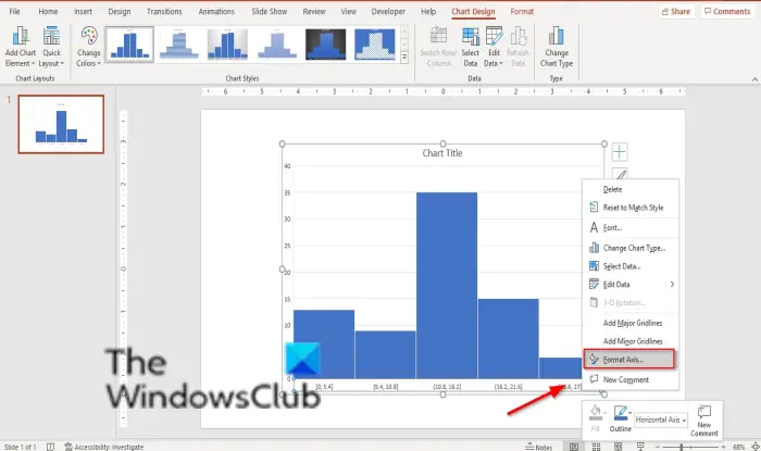
Right-click the vertical axis of your chart and select the Format axis option.
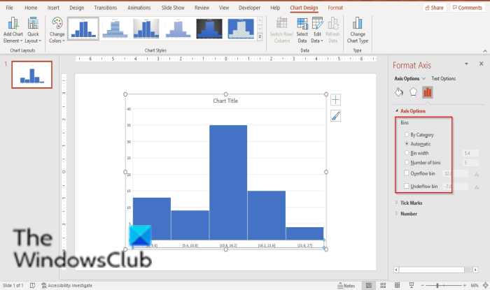
A Format axis pane will open on the right.

In the Axis options category, you can choose how you want your Histogram chart to be displayed.
You can choose to display your charts by any of the six bins shown: Category, Automatic, Bin width, Number of bins, Overflow bin, and Underflow bin (click on them to see the results).

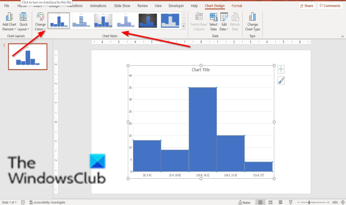
On the Chart Styles tab, you can change the style of your chart by clicking the images in the Chart styles gallery.
You can change the color of the chart by clicking the Change color button in the Chart Styles group.
Now we have a Histogram.
We hope this tutorial helps you understand how to create a Histogram chart in PowerPoint; if you have questions about the tutorial, let us know in the comments.