Charts are used to display graphical data that your audience can understand. In Microsoft Office programs such as Excel, PowerPoint, Outlook, and Word, there is a variety of charts that people can use to showcase their data visually. In this tutorial, we will discuss how to create a Histogram chart in Microsoft Word. A Histogram chart is a graphical representation that shows frequency data; it has a structure like a bar graph that organizes a group of data points into user-specified ranges.

How to create a Histogram Chart in Word
Follow the steps below on how to create a Histogram Chart in Microsoft Word:
- Launch Microsoft Word.
- Click Insert and click Chart.
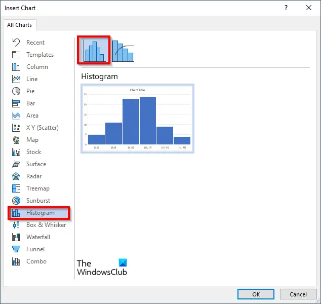
- The Insert Chart dialog box will appear.
- Click the Histogram chart icon on the left pane.
- Choose the Histogram option on the right of the pane, then click OK.
- A Mini Excel spreadsheet will appear; enter the data.
- Close the spreadsheet.
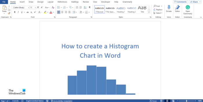
- Now we have a Histogram chart.
Launch Microsoft Word.
Click the Insert tab and select the Chart button in the Illustration group.

In the Insert Chart dialog box, click the Histogram chart icon on the left pane.
Choose the Histogram Option.
Then click OK.

A Mini Excel spreadsheet will appear; edit the spreadsheet.
When the Mini Excel spreadsheet appears, it will show you an example of how to format the Histogram chart.
Enter some frequencies into the spreadsheet and then close the spreadsheet.

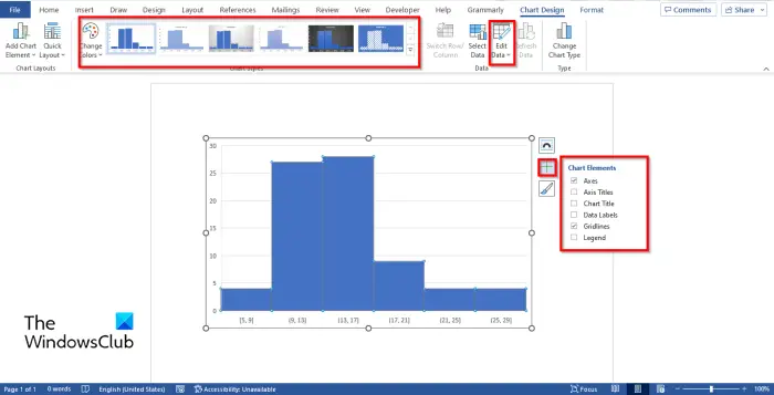
If you want to include or exclude elements from the chart, you can click the chart, and you will see the Chart Elements button.
Select or deselect the Axes, Axis Title, Chart Title, Data Labels, Gridlines, and Legend.
You can also change the Chart Style or color on the Chart Design tab.
If you want to re-edit the chart, click the Edit Data button in the Data group, and the Mini spreadsheet will appear where you can re-edit your chart data.
Read:
What is the difference between a bar chart and a histogram?
The difference between a bar chart displays categorical data or information that is separated into different groups based on characteristics, while histograms display numerical or quantitative data in bins, which is data that you can measure with numbers.
What are the disadvantages of histograms?
Below are some disadvantages of a histogram.
- It does not allow for the detection of relevant values.
- It depends too much on the number of bins.
- It depends on the variable’s maximum and minimum.
- It does not allow to discern continuous from discrete variables.
- It makes it hard to compare distributions.
- It is hard to make if you don’t have all the data in memory.
What is one benefit of a histogram?
The purpose of the Histogram chart is to display a large amount of data and the occurrence of data values; it easily determines the median and data distribution and shows the visual representation of data distribution.
READ: How to create a Flowchart in Microsoft Word
What does a histogram show?
A histogram shows the frequency of numerical data using rectangles. The height of the rectangle (the vertical axis) represents the distribution frequency of a variable (how often that variable appears.)