Charts are used to show a graphical representation of data to audiences. Charts are frequently used in businesses to showcase important data, such as using charts in marketing to describe a sale within the month or year. Sometimes individuals in Microsoft Excel will create customs charts that are different from the original charts, for instance, a Lollipop chart. The Lollipop chart is like the bar chart but has a unique appearance. In this tutorial, we will discuss how to create a Lollipop chart in Microsoft Excel.
What is a Lollipop chart?
A variation of a bar chart where the bar is replaced with a line and a dot at the end. Lollipop charts and bar charts are similar; they make comparisons between different items and categories.
How to create a Lollipop Chart in Excel
Follow the steps below to make a Lollipop chart:
- Launch Excel > Select the range of cells.
- Click the Insert tab and click the Insert Column or Bar Chart button.
- Click the Clustered Column option > Click the Chart Design tab.
- Click the Add Chart Element button.
- Hover the cursor over Error Bars and select Standard Error.
- Right-click the error bars in the chart, then select Format Error Bars.
- Select the Minus, No Cap, and Percentage options and change the percentage to 100% on the Format Error Bars pane.
- Click the Fill and Line tab, choose a color, and width, then choose the Oval arrow in the Begin Arrow menu.
- Right-click the column bar and select Format Data Series from the menu.
- On the Fill and Line tab, select No Fill in the Fill section and No Line in the Border section.
Close the pane, and we have a lollipop chart.
Launch Microsoft Excel.
Type your data or use existing data from your file.
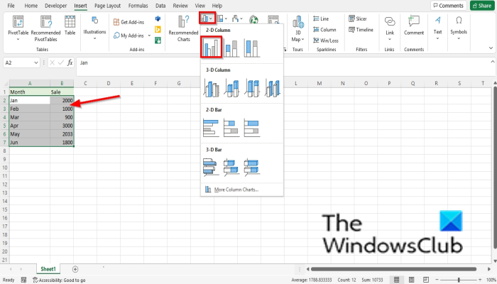
Highlight the range of cells containing your data.
Then click the Insert tab and click the Insert Column or Bar Chart button.
Click the Clustered Column option under the 2-D Column.
The chart is inserted into the spreadsheet.
Ensure that the chart is selected, then click the Chart Design tab.
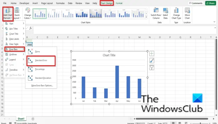
Click the Add Chart Element button.
Hover the cursor over Error Bars and select Standard Error.
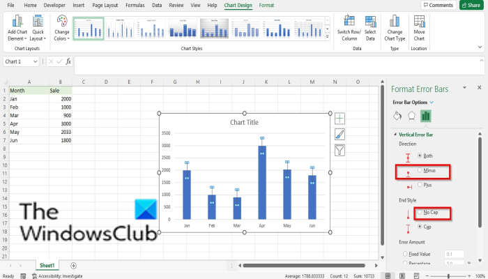
Select and right-click the error bars in the chart, then select Format Error Bars from the context menu.
A Format Errors Pane will open.
In the Direction section, select the Minus option.
In the End Style section, select the No Cap option.
In the Error Amount section, select the Percentage option and then change the percentage to 100%.
Still on the Format Error Bars pane.
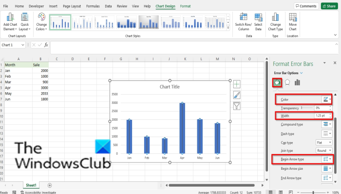
Click the Fill and Line tab.
Click the color button and choose a color if you desire.
Change the width of the color bar
Select the Oval Arrow option from the Begin Arrow drop-down menu.
An arrow with a round end.
Now you need to hide the column bars in the chart.
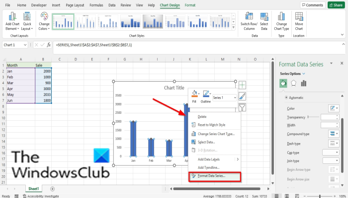
Select the column bars, then right-click the column bar and select Format Data Series from the menu.
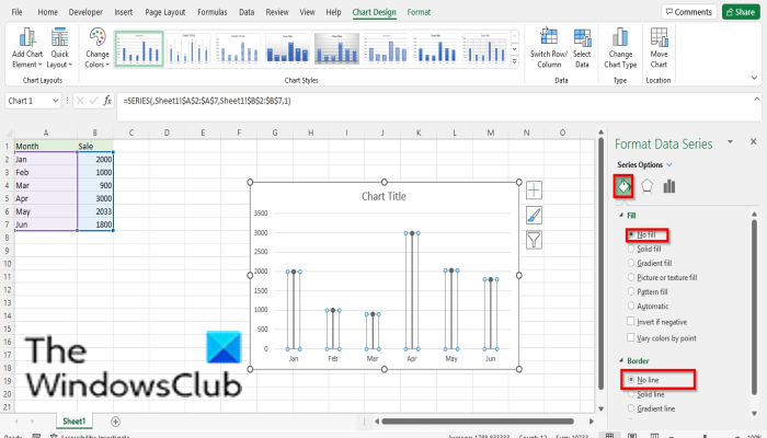
A Format Data Series pane will open.
Ensure it is on the Fill and Line tab.
In the Fill section, select the No Fill option.
In the Border section, select the No Line option.
Close the Format Data Series pane.
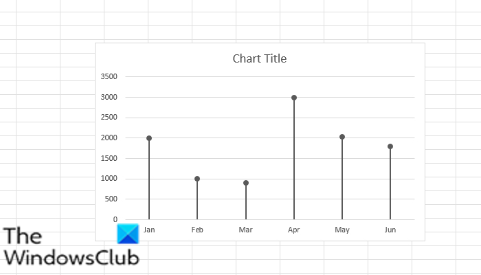
Now we have a lollipop chart.
READ: How to create a Funnel Chart in Excel, PowerPoint, Word
How do I make a lollipop chart?
Lollipop charts are custom-made using the bar chart or the column; it looks like a line with a stick. The tutorial in this article describes the steps in making a lollipop chart. You can use the lollipop chart just like the bar chart in ranking or showing trends.
READ:
- How to create a Bubble Chart in Excel
- How to create a Gauge Chart in Excel
- How to create a Treemap chart in Excel
We hope this tutorial helps you understand how to create a Lollipop Chart in Microsoft Excel; if you have questions about the tutorial, let us know in the comments.