In Microsoft Excel, there are various built-in charts that users can use, such as bar graphs, columns, pie charts, and line charts, to display their data, but in some cases, users will create unique charts, such as the Run chart, to display data to their audiences. A Run chart is a graph that displays observed data in a time sequence. In this tutorial, we will explain how to make a Run Chart in Excel.

Charts are important when users what to show their data in graphics to their users so that it is easy to understand. Charts are useful to summarize large data, show data categories in a frequency distribution and estimate key values.
How to create a Run Chart in Excel
Follow the steps to make a Run Chart in Microsoft Excel:
- Launch Microsoft Excel.
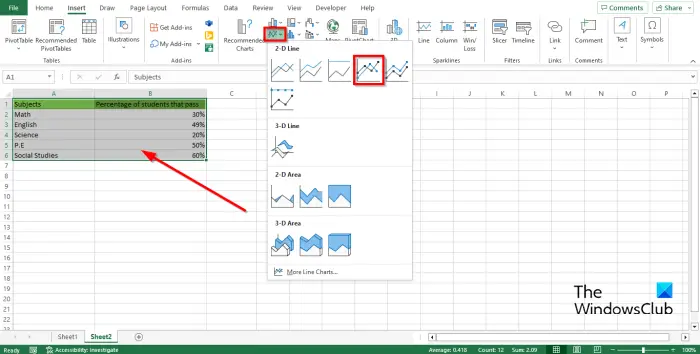
- Type your data in the Excel spreadsheet and Highlight the data.
- Click the Insert button, click the Line button, then select Line with markers from the menu.
- Right-click the chart and select Cut.
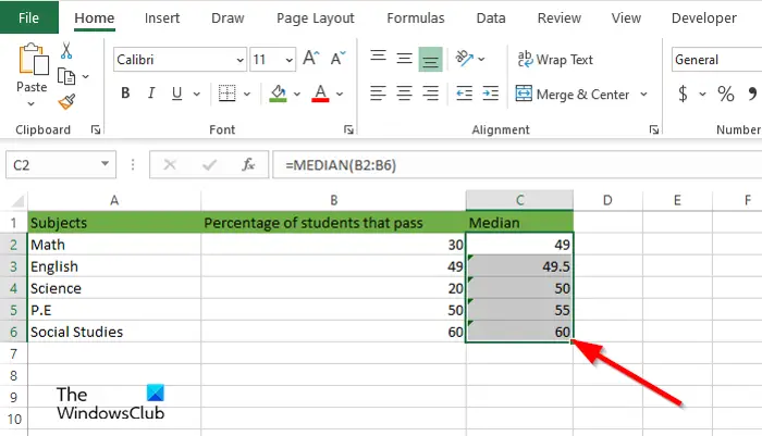
- Enter the Median formula, then select the range of cells containing the values you want to find.
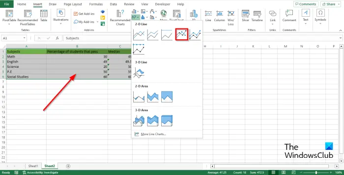
- Drag the Fill handle down to show the other results and then click the insert tab, click the Line button, then select Line with markers from the menu again.
Let us see this in more detail.
Launch Microsoft Excel.
Type your data in the Excel spreadsheet.

Highlight all the data on your spreadsheet that you want to include in the chart.
Then click the Insert button, click the Line button in the Charts group, and select Line with markers from the menu.
Now right-click the chart and select Cut.
We are going to add a median line to the chart.

Enter the formula Median and the range of values; for example =MEDIAN(B2:B6).
Drag the Fill handle down to show the other results.
Highlight all data on the spreadsheet (including the Median).

Then click the Insert tab, click the Line button in the Charts group, and select Line with markers from the menu again.

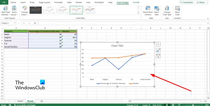
You will notice that a line summarizing the median is added to the chart.
Now we have a run chart.
We hope you understand how to create a Run chart in Excel.
Why is it called Run chart?
Run charts are used to monitor the performance of the process over time with a focus on process improvement; it displays the measurement of the series over time. Run charts are also known as trend charts or series plots.
READ: How to easily export Excel Charts as Images
What is the difference between a Run chart and a Control chart?
The Run chart and the Control chart are similar, but there is some difference. A Run chart will help to monitor data over time to detach shifts, trends, or cycles. Run Charts will help to spot upward and downward trends. Control charts help you understand the variation that is always present in processes. The control chart includes upper and lower control limit lines with a centerline.
Leave a Reply