Photoshop has so many features to make your work stand out. You can mix and match so that you can create unique artwork. This article will teach you how to give boring text a golden look using Photoshop’s layer styles. There are so many Photoshop tips, tricks, and features that can be shared, so do come back to learn more.
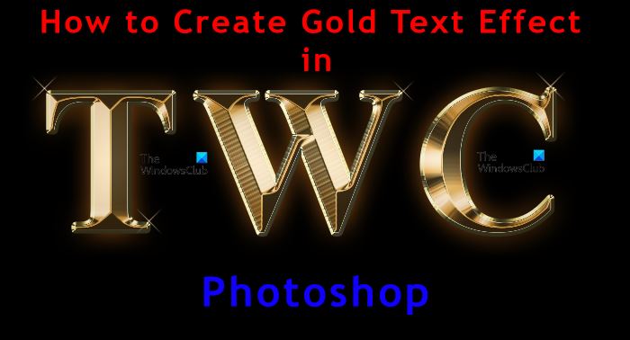
How to create Gold Text Effect in Photoshop
Creating gold text effects with Photoshop can be used for logos and artwork for a variety of works. The gold text effect can be used for a jewelry company’s logo. The gold text effect is created using Photoshop’s layer styles. This is using a combination of different layer styles to achieve the desired effect. The steps involved are:
- Prepare the Canvas and the Text
- Apply Layer Effects
- Apply Finishing Touches
- Save
1] Prepare the Canvas and the Text
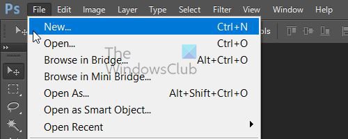
The first step is to open Photoshop and create a new file. Go to File then New or press Ctrl + N on your keyboard.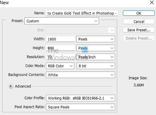
A New document dialogue window will appear. Enter the dimensions of Width 1600 pixels, Height 800 pixels, and Resolution 72 Pixels/Inch for the document. You may also add the name of the document at the top. When all the information is entered click OK to create the document.
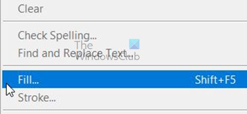
Gold will shine better on a black background so change the canvas color to black. To change the background to black go to Edit then Fill or press Ctrl + F5.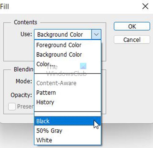
In the Fill, Dialogue box Contents section set Use option to Black then press OK.
Choose the Horizontal Type Tool from the Tools panel on the left.
Choose the font that you want to turn to Gold. Go to the menu bar at the top and choose the font from the drop-down menu. Choose the Font, make it Bold and choose size 72, this is the biggest size that can be chosen but it can always be resized after it is written.
On the menu bar click on the Color Swatch and a Color Picker will appear.
Set the value of R, G, and B to 255, each. This will make the text white. Confirm the information in the color picker by pressing Ok. Set the text color to white so it is visible against the black background.
Click in the document and type. For this article, the text will be “TWC”, but you can write whatever text you want. The text will be small compared to the background; however, it will be made bigger in the next step.
To confirm the text, click on the Checkmark on the menu bar.
To resize the text, go to Edit then Free Transform or press Ctrl + T. in Photoshop CC just hold any of the corner handles and drag to the desired size. In Photoshop CS6 or earlier, press Ctrl + Shift while you hold the corner handle and drag to the desired size. In Photoshop CS6 Ctrl + Shift will cause the text to resize evenly without distorting. In Photoshop CC, the proportions are automatically constrained so no need to hold any keys.
To center the text, hold it and drag it to the center of the canvas. Press Enter to close Free Transform.
Make a copy of the text by holding Alt while dragging the text or going to the layers panel, Right Click on the text and choose Duplicate Layer or hold the text layer and drag it down to the Create New Layer Icon.
A copy of the text will appear above the original in the Layers Panel. Both texts should be in the same spot on the canvas so that they will look like one.
2] Apply Layer Effects
To create the gold effect a gradient overlay will have to be added. The reason for the gradient is because it is a variation of colors, to get the gold effect, there needs to be a variation of colors, lights, and shadows.
Go to the layers panel and select the copy of the text. In this case, it is a TWC copy, then click the Add a Layers Style Icon at the bottom.
In the Layers Effect menu choose Gradient Overlay.
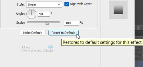
The Gradient Overlay option appears. Click Reset to Default to clear any previous settings.
Edit the Gradient color by clicking the gradient swatch.
Double click the left Color Stop below the Gradient Editor.
A Color Picker Will appear, set the R-value to 247, the G-value to 238, and the B-value to 173. Then click OK to close the color picker and confirm the change.
In the Gradient Editor double click on the color stop on the right side of the gradient editor.
A Color Picker Will appear, set the R-value to 193, the G value to 172, and the B value to 81. Then click OK to close the color picker and confirm the change.
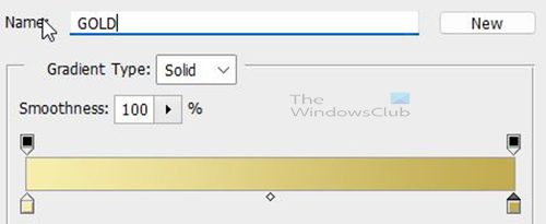
This gradient will be needed again so save it. To save the gradient name it Gold in the Gradient Editor then click the New button to save it.
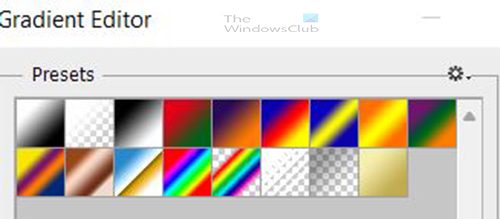
A thumbnail of the Gold gradient will appear in the Presets area. Click ok to close the gradient editor.
In the Layer Style Dialogue box, change the Style of the gradient to Reflected, This will move the darker gold color to the top and the bottom of the text, with the lighter color in the middle.

Text with reflected gradient style.
In the Layer Style dialogue box, choose Bevel and Emboss by clicking directly on the name.
Clear any previous custom settings by clicking the Reset to Default button.
In the Structure Section set Style to Inner Bevel and Technique to Chisel Hard.
Go to the Shading section and click the little arrow to the right of the Glass Contour Thumbnail. Double click on Ring-Double to select it.
Set the Angle to 1200. Turn on the Anti-aliased option to smooth any jagged edges.
To add more contrast to the effect, increase the Highlight Opacity and the Shadow Opacity to 75%.
Close up the space inside the letters by increasing the Size of the Bevel and Emboss effect, to make the text look more like solid gold.
To do this click inside the Size value box and use the up arrow on your keyboard to slowly increase the value. You will notice the letters filling in from the outer edge towards the center. The exact size value will depend on the size of the text you used, in this case, a size of 45 works for the text in this demonstration.
To enhance the lighting and add more contrast to the reflection in the letters, increase the Depth Value by dragging the slider to the right. You can also place the cursor in the Depth value box and use the up or down arrow on the keyboard to increase or decrease the number. You can watch the changes in the lighting and contrast of the text.

The text is now starting to look like real gold.
Look for the effect Inner glow in the Effects box and click on the name.
Reset Inner Glow settings to default to clear any previous settings.
Change the Blend Mode to Multiply and the Opacity to 50%.
Click the Color Swatch to change the Inner Glow color.
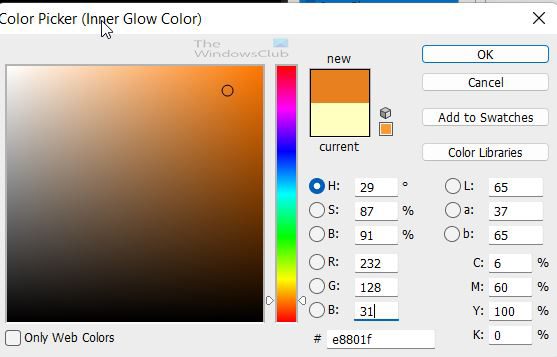
In the Color Picker change the R-value to 232, G to 128, and B to 31. Click OK to close the Color Picker.
Increase the Size of the glow until it fills the letters. You can change the size by using the slider or clicking in the size value box and using the up arrow on the keyboard to change the value. The Size value is set to 85 px for the example used for this article. Use a size value that you are comfortable with. Press OK to close the Layer Style Dialogue Box when you are finished.
Go to the Layers Panel and select the original type layer, in this case, it is TWC. Click the Layer Styles Icon at the bottom and choose Stroke. Reset to Default to clear any previous stroke settings.
Change the Fill Type of the Stroke to Gradient. Click on the small arrow and choose the Gold gradient that was previously saved.
Change the size of the Stroke to about 9 Pixels by moving the slider or clicking inside the stroke value box and using the up arrow on the keyboard to change the value up. Watch the stroke change and choose a number that suits your style. The stroke size used for this article is 9 Pixels.
Change the Position of the gradient to Outside. Change the gradient Style to Reflected.

The text with the Original Text layer with a golden stroke.
Apply Bevel and Emboss to the stroke by clicking on the word Bevel and Emboss in the Layer Style Dialogue box on the left.
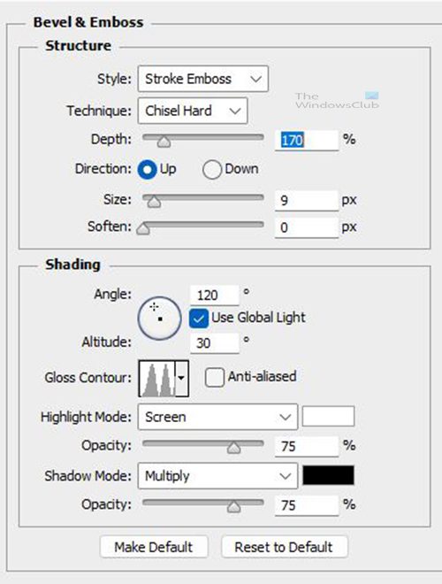
Do not Click Reset to Default because most of the customized settings made before will be used. Change the Style to Stroke Emboss and the Technique to Chisel Hard. Set the Size value to the same as the size of the stroke which in this case was 9.
Depth: 170%
Angle: 120°
Gloss Contour: Ring- Double
Anti-Aliased: Checked
Highlight Opacity: 75%
Shadow Opacity: 75%
These are all the Bevel & Emboss settings that should be there. If not just change them.
In the Bevel & Emboss option there is also a Contour option, turn on the Contour option.
While still in the Layer Style dialogue box, click the word, Outer Glow.
Put the Opacity of the Glow to about 40 and click the Glow Color Swatch.
The Color Picker will show up, set the R value to 232, G to 128 and B to 31, and then click OK.
Increase the Size of the glow to around 60 or whatever glow size you find appropriate. When you are done click OK to accept changes and close.

This is the text with all the outer glow effects added.
3] Apply Finishing Touches
To finish off the gold effect, sparkles will be added. It is best to add the sparkles on their separate layer. Go to the Layers panel Click the copy layer (the top layer), in this case, it is the TWC copy.
To add the new layer, hold the Alt key and click the Create a New Layer Icon in the Layers Panel.
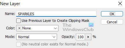
A New Layer dialogue box will appear for you to name the layer. Name the layer Sparkles and click ok.
A new layer name SPARKLES is added above the text layer.
To add the sparkle to the gold, you will need to use one of Photoshop’s brushes. Go to the Tools panel on the left and choose the Brush Tool.
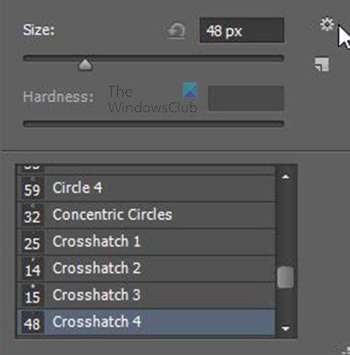
With the Brush Tool still selected, Right-click on the canvas to bring up the Brushes option window. Select the Settings Gear Icon on the top right edge.
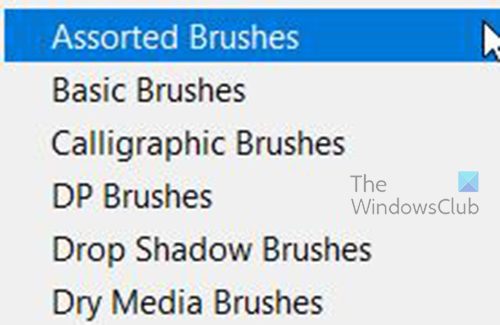
Choose Assorted Brushes from the dropdown menu.

The menu will appear for you to choose to replace the current brushes with the brushes from assorted, Click Append to choose to add the assorted brushes to the current brushes.
Scroll down in the brush preset picker and look for 48 Crosshatch 4, it is the one that looks like an X, when you find it, double click to use it.
You will need to get a sample of the gold color for the sparkle. Hold Alt to temporarily switch to the Eyedropper Tool then click on the gold text (choose a light gold area). Release Alt when you have clicked on the gold text.

Add the sparkle by clicking on random places on the text. To add variety, vary the size of the brush before each click. Make the brush larger by clicking the right square bracket and smaller by clicking the left square bracket.
Try not to add too many sparkles to the text or it could look crowded. Click Ctrl + Z to undo if you made a mistake.
You can choose to lower the opacity of the sparkles if they are too bright, but that is optional. If you want to lower the opacity, go to the Layers Panel, and use the opacity slider to lower the opacity.
4] Save
After all that hard work it is now time to save. To get the full effect of the gold in the best possible colors, a raster image is the best option for saving. Assuming that the image will not be made very large. You could save it as a JPEG image so that it is both small and will look quite shiny. However, I would save it as a PNG to eliminate the white background that will show when it is opened. With the background being only black, the gold effect will shine even more.
To save go to File then Save As or Shift + Ctrl + S.
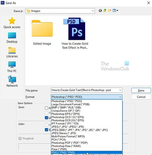
The Save As dialogue box will appear and you can add the file name. If you had named the file when you were setting up the new file, then the name would already be in the file name box. Go to the Format box and click the arrow the choose the format you want. It is best to save the file first as a PSD so that it is editable then save it as another format (JPEG or PNG), for sharing or using on the web.
To save specifically for the web go to File then choose Save for Web or click Alt + Shift + Ctrl + S.
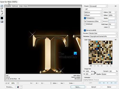
A dialogue box will appear, and you choose the options you want and click Preview, Save, Cancel, or Done.
Read: How to add Copyright and Contact Information to Images in Photoshop
Why is learning to Make Gold Text Important?
Learning to make gold text is essential because you can use the same principles to make other color text effects. This can be a helpful skill in making other artwork for logos, print, etc. The steps used to make the text have a golden color can be used to make other objects gold or silver, or any other color with sparkles.
Can These Steps be Used to Make Silver Text?
The principles are the same, you just need to find something that is silver so that you can sample the color to use. To get accurate colors for your artwork, you should get real examples of items and take Pictures or find them on the internet and use Photoshop to sample the colors and save them as color swatches for later use.
Remember that items do have reflections and shadows, so try to get realistic samples and sample the different aspects of the colors of the items to make your artwork look more realistic.
Why is Save for Web Different from Save As?
Save for Web has a lot of options that will make saving the artwork optimized for use on the web. You can preview the image on a webpage and even inspect it on the webpage to see the code. If you create web pages, you can copy this code to use on the webpage. There are multiple file formats in the Save for Web option, and they are optimized for use on the web. You can make more changes to get it to fit your purpose.
How can I Get Accurate Colors for Objects in the Artwork I Create?
You can get accurate colors for your artwork by creating your color swatches. Get samples of items you want to work with that you want accurate colors, and sample them to create swatches. You can also search for colors online, usually close to what you want.
However, getting the real item will show how the colors show when the light hits them. You can get the item, take a high-resolution picture, and get it on your computer. You can then use photoshop to take samples of the colors of different parts of the picture that represents different lighting. You can use these color swatches to get realistic color and lighting effects when you create your artwork.
Leave a Reply