Did you know that Illustrator can be used to create graphs? Yes, you heard right; this article will show you how to create graphs in Illustrator.
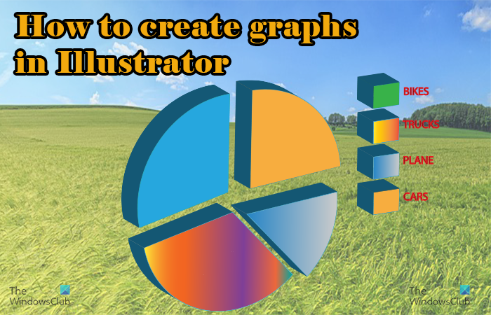
Graphs are used to visualize data for better understanding and comparisons. Illustrator allows for the creation of graphs to represent data visually, especially to create infographics. Illustrator uses vector which is best used for images that will be enlarged. The vector graphic will keep quality even when stretched to a large size.
How to create Graphs in Illustrator
Infographics are sometimes made to be printed or displayed in very large formats. This is why having vector graphs created in Illustrator is important. Here are the steps involved in creating graphs in Illustrator.
- Open and prepare Illustrator
- Select the graph tool
- Create the graph
- Change graph color
- Change graph font
- Edit the chart data
- Changing graph type
- Placing the legend text under the graph
1] Open and prepare Illustrator
This first step is where you will open Illustrator and create the blank document for your graph. Click the Illustrator icon to open Illustrator.

You will see the Illustrator splash screen appear as Illustrator is loading. If your computer is super fast, you may not see the splash screen at all. You will then see Illustrator open up and ready for you to create a new document.
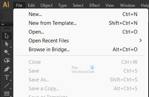
Go to the top menu bar and press File then New or press Ctrl + N to bring up the New document options window.
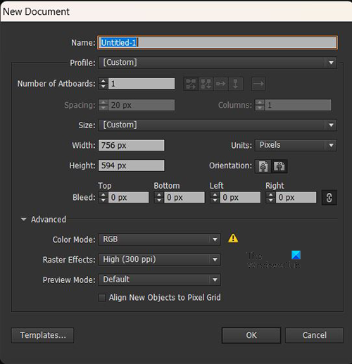
In the New document options window you can choose the options that you want for your new document. When you have chosen all the options that you want, press Ok to create the new document.
2] Select the graph tool
This step is where you will select the type of graph that you want to use to represent your data. At the point where you would create this graph, you would have had the information for the graph. You will need this data to know which graph you want to use and the data to enter to create the graph.
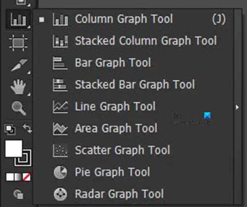
Go to the left tools panel and click on the Graph tool. You may see the graph tool you want at the top but if not, long press on the graph tool to bring up a list of the available graph tools. The graph tool available are; Column graph tool, Stacked column graph tool, Bar graph tool, Stacked bar graph tool, Line graph tool, Area graph tool, Scatter graph tool, Pie graph tool, and Radar graph tool.
3] Create the graph
There are three methods that you can use to begin creating the graphs, they will be discussed and demonstrated below.
Select the graph tool then click and drag
When you click on the graph tool type that you want, click and drag on the blank document to create the graph. By default, the graph will be dragged in a rectangular shape, however, if you want to make it square, hold Shift + Alt as you drag to create the graph. Here the Column graph tool is selected to create the graph.
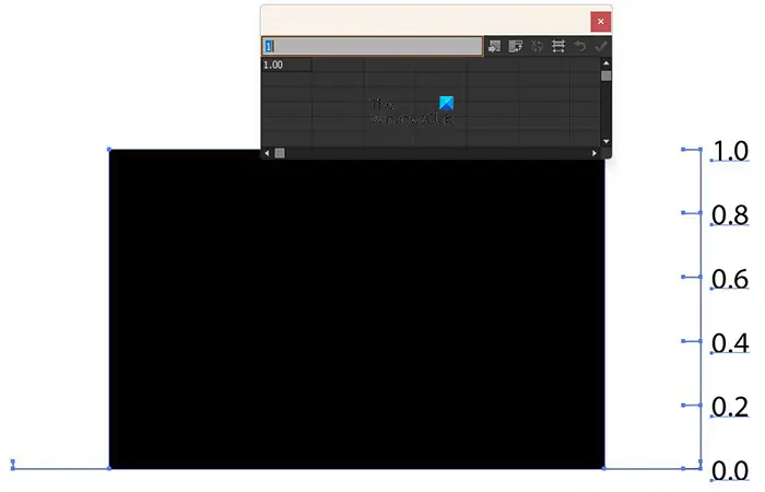
This is when the graph is created by selecting and then dragging. You see the window to enter the data. There is just one column on the graph because there is just one piece of data in the data window.
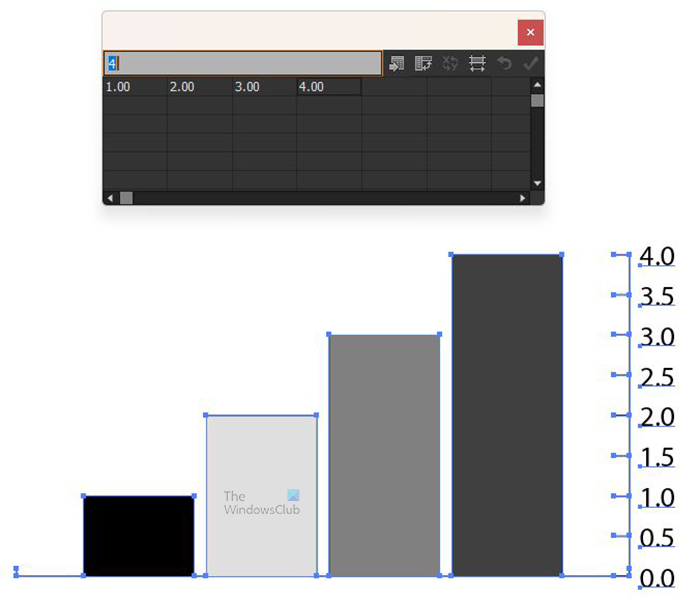
You can enter data by clicking each cell that you want data to go in and then typing the data (numbers or text). You then click the Apply (tick) to have the data reflected in the graph. The above image has different bars representing the data that was entered into the table. The data was entered horizontally into the top rows of the table.
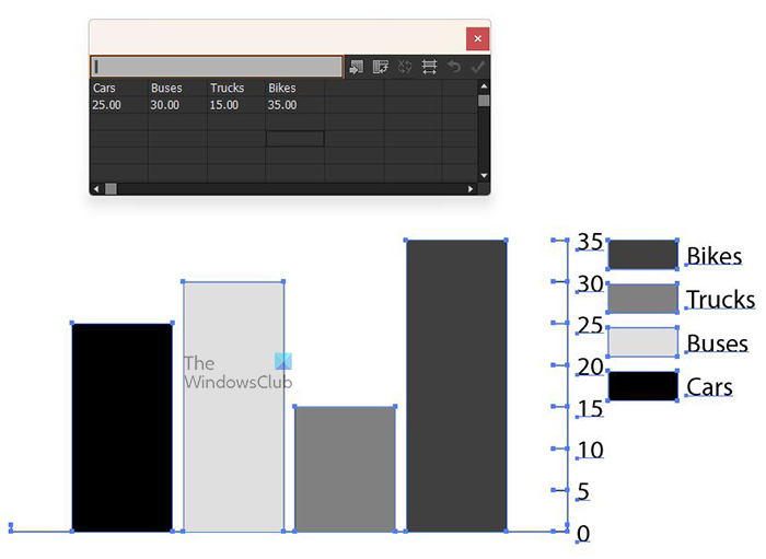
You can also enter text into the table. If you want a key/legend to be presented in the graph, you can enter text in the top row and then the corresponding numbers under the text in the rows below.
You can make the words fit under the columns in the graph. When you have created the graph and created the text above and the numbers below as it is done above, you can then click the Transpose row/column button. You will see the layout of the table change, you then click the Apply tick to see the changes in the graph.
Create the graph by clicking the document
You also can create the graph by selecting the graph tool that you want and then clicking on the document.
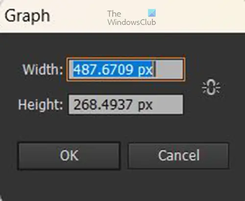
You will see a window appear for you to enter the graph’s Width and Height. You can enter the values for both or keep the default. You will also notice that there is a Chain icon beside the size values. You can click to link the values of the height and width to constrain them so that one size will change automatically in proportion to the other. When you have made the size changes or you decided to keep the default, click OK to create the graph. You will then see the graph with the data window for you to enter the graph’s data.
Create the graph by double-clicking the graph tool
Another way to access and enter the graph tools is to double-click on the graph tool in the left tools panel.
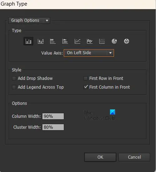
You will see a Graph type options window appear. Using this option allows you to enter more options for the graph that you want to create before the graph is placed in the document. here are some of the options that you will see and what they mean.
Type – This is where you will select the type of graph that you want to create for example bar graph or pie or any of the others.
Value axis – The value axis is where the data numbers are displayed. You can choose to have it displayed on the right, the left, or on both sides.
Style – this is where you can add some things to make your graph visually appealing and also full of information that you think will be relevant to the persons who will view the graph.
Options (available with some graph types) – Depending on the graph tool that is displayed in the tools panel when you double-click, the Options heading may not be there, or it may have different options to choose from.
For the column graph, you will see Column width and cluster width in percentage, you can place the values that you want there or keep the defaults. Column width will show how wide the columns are and Cluster width will show the width between the columns.
This option with the same set of options to choose from, you will see it available for the Column graph tool, Stacked column graph tool, Bar graph tool, and Stacked bar graph tool.
The other graphs will not have Options, or the choices will be different.
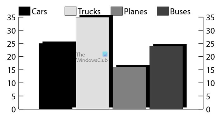
This is the graph tool created using this method with the Drop shadow added. Note that those options will become the default for all graphs even if they are not created using this method, to change them you will have to go back into these settings and unselect them. The Drop shadow is selected, the Legend across the top is selected and the Value axis is placed on both sides.
Read more: How to create 3D Globe with the World Map in Illustrator
4] Change graph color
Now that the graph is created, you may want to change the color to make the graph more attractive and the information stands out. When the information on the graph is broken down into colors the information is easier to see and process. If you click on the graph and then click on a color swatch, you will change the overall color of the graph, so it will be one single color for all of the graph.
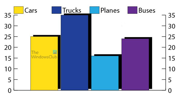
However, if you want to change the color of individual bars (if it is a bar graph) you will need to click the Direct selection tool then click on each of the columns and change the color, then click the corresponding key/legend and change the color. This would work on pie graphs or any other graphs, just click on each element that you want to change. Above is the graph with the color of the bars changed but the drop shadow is still black.
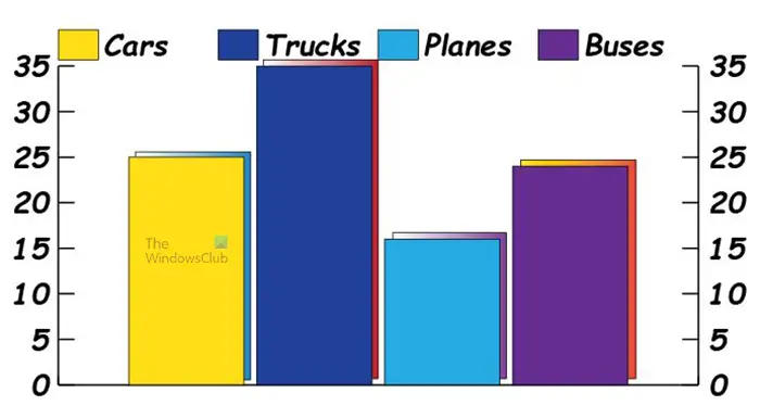
To change the color of the Drop shadow, you would use the same Direct selection tool and select the shadow to change the color. You will notice that the shadows are overlapping with the column beside it, you can change that by clicking on the shadow with the Direct selection tool and then moving the shadow with the arrow keys. Above is the graph with the color of the drop shadow and also the key/legends changed
Note that you can also choose a gradient to color the bars and also shadows. However. If you choose a gradient for the bars, the section of the shadow behind it will show through the bars. The gradient color for the bars would be best if the bars had no shadow behind them or if you use the Pathfinder tool or another tool to cut off the piece of the shadow that is hidden behind the graph elements.
5] Change the graph’s font
While you are editing you may not like the font that is there. It may not be visible enough for display, it may just be appropriate. You may also want to change the size of the font to make it more visible. You may also be considering adding some color to the font. To make these changes to the words and also the values you just use the regular selection tool and select the graph then go to where the font style is and change it and all the fonts will change.

This is the graph with the font style changed, the font was also made bold italic.
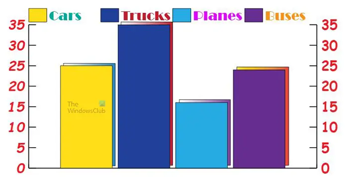
You can also change the font style and colors for individual words in the graph. You may choose to make the legend/key a different font and color from the values. To change them you just select them with the Direct Selection tool then change the font and the color.
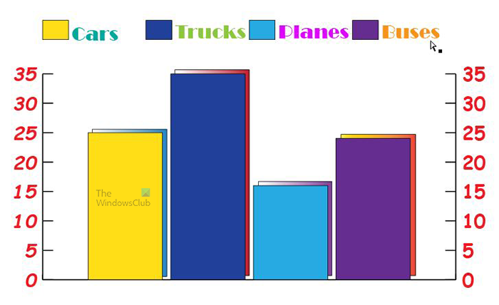
You may notice that the legend is very close to the bars in the chart, you can adjust them by using the Direct selection tool to select all of the words and color swatches in the legend then move them to where they are comfortable for you. You can also use the Direct selection tool to select all the graph information except the legend then move the graph down so that there is space between the graph and the legend.
You can also use the Direct selection tool to move the bars in the bar graph and the other parts in any of the graphs. Just select the parts in the graph with the Direct selection tool then drag or use the arrow keys to move the selected part.
There are a lot of things that you can do with the graphs in Illustrator. They are also very easy to change and manipulate to fit your presentations.
6] Edit the graph data
To edit the graph date right click on the graph and choose Data from the menu that pops up. You will then see the data table that you saw when you were just creating the graph. To change the legend, you would change the text and to change the values you change the numbers. When you are finished editing, click Apply then close the data window.
7] Changing the graph type
A graph that is already created can be changed to another type of graph. You can achieve this by right-clicking on the graph and then from the menu that appears selecting Type. You will see the Graph type options window appear, select the type of graph that you want then make any other changes that you want and press OK to change the graph.
8] Placing the legend text under the graph
You can make the words fit under the columns in the bar graph. You do this by typing in the date horizontally (words above then the numbers below), and you then click the Transpose row/column button. This will make them change to vertical and add the words under each element it represents without adding a legend. This works for the bar graph and some of the other graphs. When you do this for the pie graph it will make a separate graph for each data represented instead of adding the words to each slice.
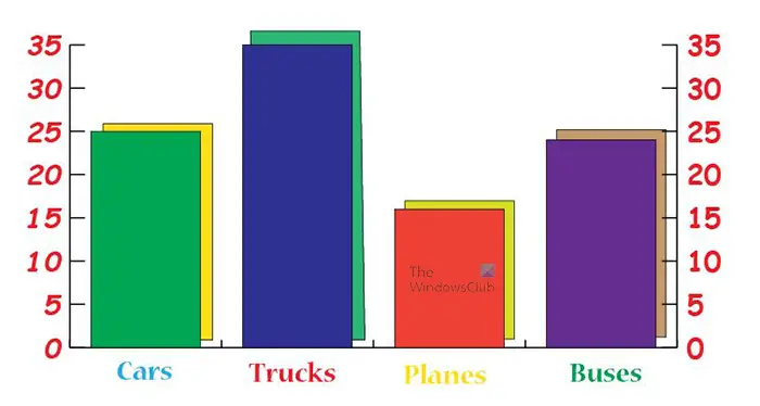
This is the graph data transposed with the words placed under the graph elements.
Read: How to create Spiral Text in Illustrator
How do I create an Area graph in Illustrator
An area graph is a graph that uses continuous lines or colors to represent data. It looks like waves of color or colors. To create the area graph, follow the steps below.
- Click the Area graph tool
- Click and hold then drag to create the area graph
- When you release the mouse you will see the data window where you will enter the data for the area graph
- Enter the words and then the numbers that will represent the data for the area graph
- When the data is entered press the Transpose row/column button. If you do not press the Transpose row/column button the data will not reflect on the graph
Where are the graph tools located in Illustrator?
The graph tools are located on the left tools panel under the Symbol sprayer tool and above the Artboard tool. the default graph is the Column graph. If you want to get to the other graphs, long-press the column graph to see the list of other graphs to choose from.
Leave a Reply