Microsoft Outlook offers features to create charts like office programs such as Microsoft Word, PowerPoint, and Excel. In Outlook, you can create charts directly in an email message. Whenever you make a chart in Outlook, it looks no different from the one you create in Excel because it is based on the Excel data source created from within your Outlook.
What is a Chart?
A chart is a graphical representation of data represented by symbols such as bar chart, pie chart, line chart, histogram, column, area, stock, funnel, etc.
How to insert a Chart in an Outlook email
To insert Charts in Outlook email messages, follow the steps below.
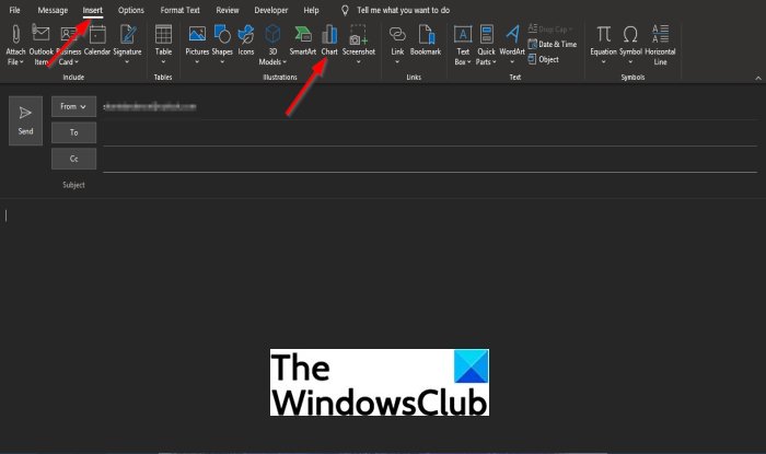
- On the New Email interface, click within the message section
- Click the Insert tab
- Click Charts in the Illustration group.
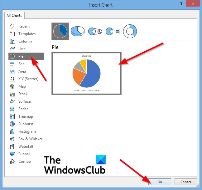
- In the Insert Chart dialog box, select the type of chart you want to create
- Then click the chart icon on the right
- Then click OK.
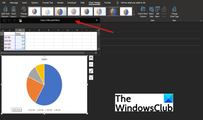
- An Excel program window will appear with mock data; update the mock data with your data.
- Close the window.
- Now, we have created a chart in the message.
On the New Email interface, click within the message section.

Click the Insert tab on the menu bar.
Click the Charts button in the Illustration group.
An Insert Chart dialog box will pop up.

In the Insert Chart dialog box, select the type of chart you want to create on the left pane.
Then click the chart icon on the right.
Click OK.

An Excel program window will appear with mock data; update the mock data with your data.
Then close the Excel program window.
Now we have a chart in our message.
How do I insert a Table in an Outlook email?
To insert a Table in Outlook, follow these steps:
- Log in to your account on outlook.com.
- Click on the New message button to start composing an email.
- Click on the Insert table icon in the toolbar.
- Select the number of rows and columns.
We hope this tutorial helps you understand how to insert Charts in an Outlook message.
Leave a Reply