Adding a graph in a spreadsheet is no big deal as long as you know the process. However, do you know that you can make a curved line graph in Excel or Google Sheets? If not, you should check out this tutorial to turn the sharp edges into smoothed lines.
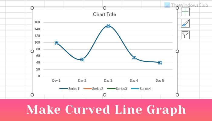
Sometimes you may need to insert a graph in a spreadsheet to show data more beautifully. A graph or chart makes the spreadsheet productive and attractively visualizes the data. It is straightforward to create and add a graph – whether you are using Microsoft Excel or Google Sheets. The problem with the default graph is the sharp edges. Although it defines the exact ups and downs of your data, some people do not like it. If you are one of them, you can smoothen the edges by following this guide. For your information, you can convert existing sharp edges of a graph into a smoothen corner as well as add a new curved graph. Either way, you do not need any third-party add-on.
How to make a curved line graph in Excel
To make a smooth curved line graph in Excel, follow these steps-
- Enter your data in the spreadsheet and select it to make a graph.
- Go to the Insert tab and insert a 2-D line graph.
- Right-click on the line and select the Format Data Series.
- Go to the Fill & Line tab.
- Check the Smoothed line option.
To get started, you need to enter the data that you want to use to create the graph. After that, go to the Insert tab and click the Insert Line or Area Chart button in the Charts section. After that, select a 2-D Line graph that you want to display in your spreadsheet.
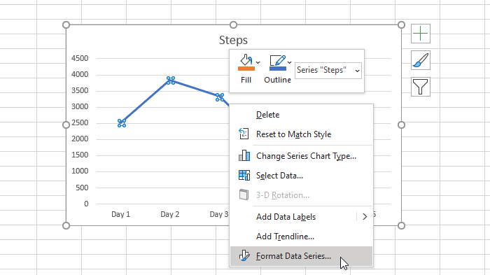
After inserting the graph, right-click on the blue line, and select the Format Data Series option.
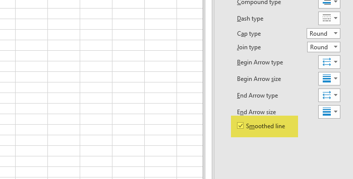
On your right side, you should see a panel from where you need to switch to the Fill & Line tab. After that, make a tick in the Smoothed line checkbox.
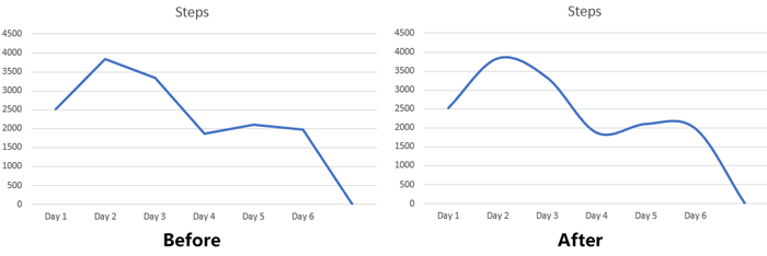
You can find the conversion immediately.
How to make a curved line graph in Google Sheets
To make a curved graph in Google Sheets, follow these steps-
- Enter all data and insert a chart.
- Convert the Chart into Line.
- Select Smooth from the Customize tab.
First of all, you need to create a spreadsheet with the proper data. Then, select all the data, click the Insert button, and select Chart from the list.
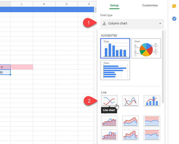
By default, it shows a chart as per your data. You need to convert it to a line graph. For that, click on the Chart, expand the Chart type drop-down menu, and select something under the Line label.
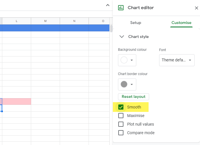
Now, go to the Customise tab, and expand the Chart style menu. Following that, make a tick in the Smooth checkbox.
Now, the sharp edges should be changed.
That’s it! Hope this tutorial will be helpful.
Read:How to create a Bar Graph or Column Chart in Excel
How do you draw a curve graph in Excel?
To draw a curved graph in Excel, you need to go through the above-mentioned steps. In short, you need to enter your data first. Then, select the data and go to the Insert tab to embed a regular graph. Next, you need to go to Format Data Series > Fill & Line tab. Finally, tick the Smoothed line checkbox. It will turn your regular graph into a curved smooth graph.
Leave a Reply