The Sunburst chart is hierarchical, and it is most effective at showing how one ring is broken into its contributing pieces, while another type of hierarchical chart, the treemap chart, is known for comparing relative sizes. The Sunburst chart is a built-in chart available in PowerPoint, Excel, and Outlook.
What is a Sunburst chart?
A Sunburst chart is a chart that represents hierarchical data, each level of the hierarchy is represented by one ring or circle with the innermost circle as the top of the hierarchy. Sunburst charts with one level of categories will look similar to a doughnut chart, while Sunburst chart with multiple levels of categories shows how the outer rings relate to the inner rings. The Sunburst chart displays each group with color and the sub-categories by division.
How to create a Sunburst chart in PowerPoint
Follow the steps below to create and insert a Sunburst chart in PowerPoint.
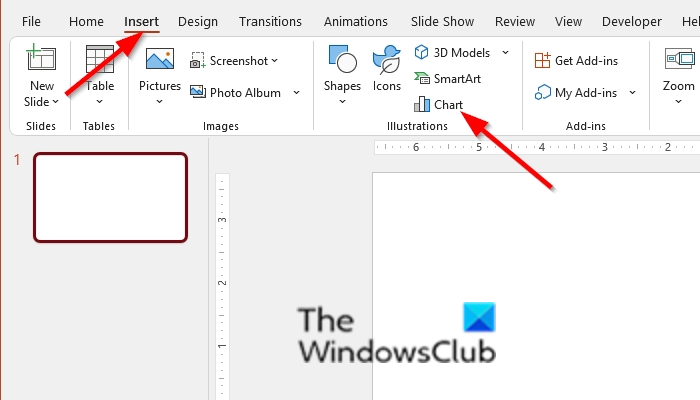
- On the Insert tab, click Chart in the Illustration group.
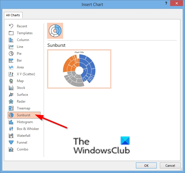
- In the Insert Chart dialog box, on the left pane, click Sunburst
- Then click OK.
- The diagram is inserted into the slide, along with an Excel spreadsheet
- Enter your data into the spreadsheet
- close the spreadsheet
- Now, we have a Sunburst chart
Launch PowerPoint.

On the Insert tab, click Chart in the Illustration group.

In the Insert Chart dialog box, on the left pane, click Sunburst.
Then click OK.

The diagram is inserted into the slide, along with an Excel spreadsheet.
Enter your data into the spreadsheet.
Close the spreadsheet.
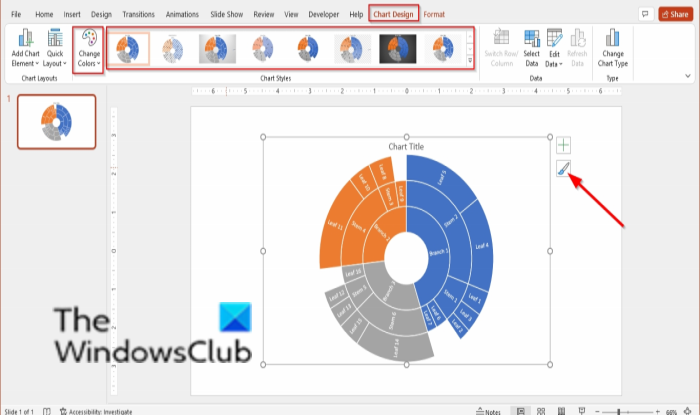
Now, we have a Sunburst chart.

A Chart Design tab will appear with features to customize your chart.
To change the style of the chart, click a style in the Chart Styles gallery.
To change the color of your chart; click the Color button, and select a color palette from the menu.
You can also change the style and color of the chart by clicking the Chart then clicking the Chart Styles icon on the chart, which will display two categories Style and Color.
We hope this tutorial helps you understand how to insert a Sunburst chart in PowerPoint; if you have questions about the tutorial, let us know in the comments.
How do I add data labels to Sunburst chart?
When you create a Sunburst Chart in PowerPoint, the labels will add automatically to the chart; if there are no labels in the chart, you can right-click the chart and select Add labels from the context menu or click the Chart Elements button at the upper right of the chart and check the check box for Data labels.
Leave a Reply